Beach House Colors
Coastal color is really about light. Seaside sun and salt spray bleach saturated colors into pale ghosts within a few seasons — that is why the classics are the classics. Five complete schemes with real paint codes, and a way to see each one on your own house.
Five Beach House Color Schemes That Work
Each scheme is a finished palette, not a single swatch — how much white trim frames the body, where the one dark note goes, what happens under the porch roof. Codes are exact. Screens shift color a little, so judge the scheme on a photo of your house, not on this page.
Classic White With a Haint-Blue Porch Ceiling
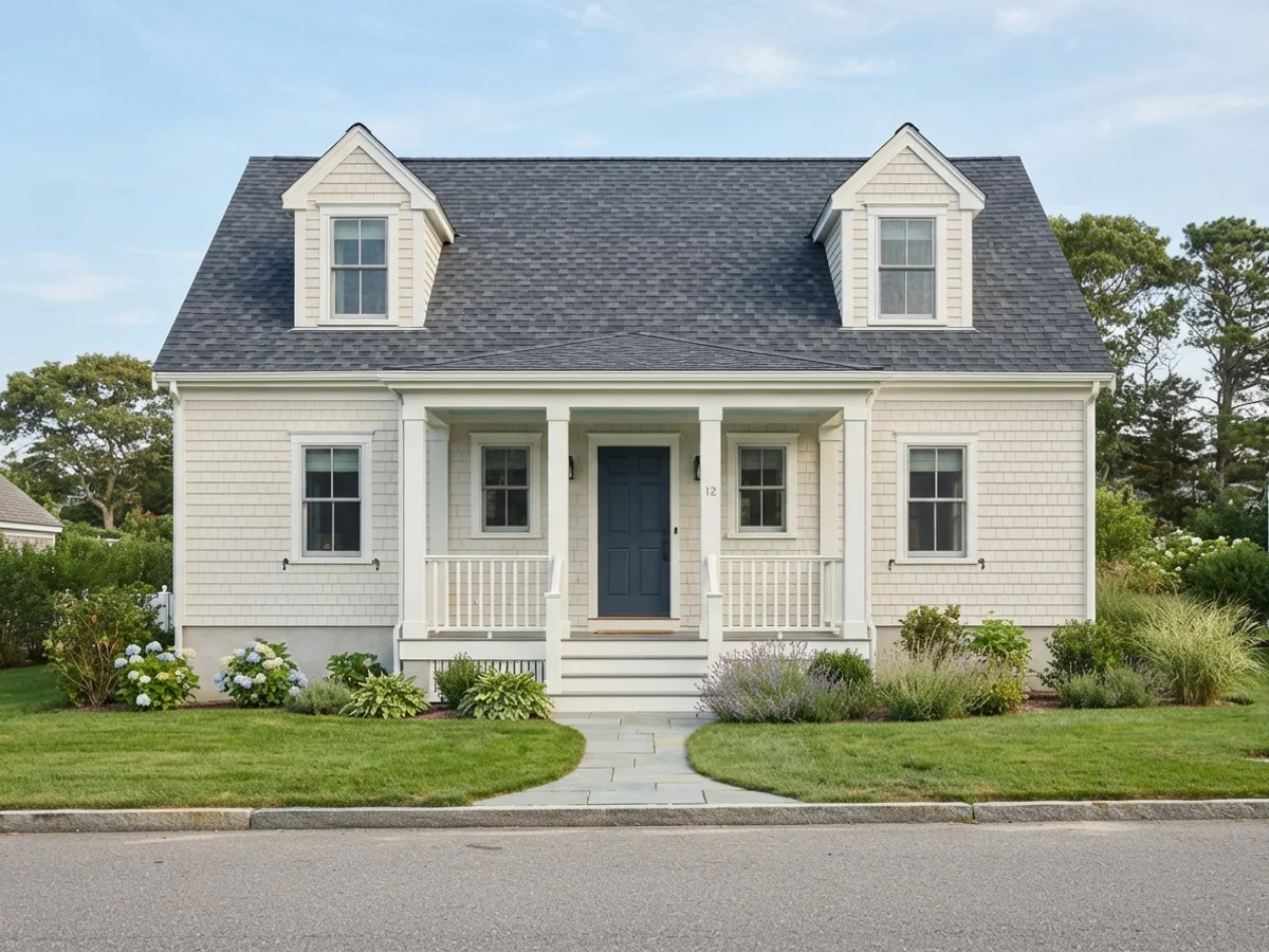
The oldest beach formula and still the hardest to beat. Soft white body, brighter white trim, and a pale blue porch ceiling — the Southern "haint blue" tradition that reads as sky overhead. Alabaster is warmer than a stark white, so it does not glare at noon. The navy door gives the whole thing one dark anchor.
Soft Gray-Blue — the Weathered Shingle Look
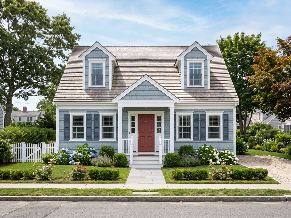
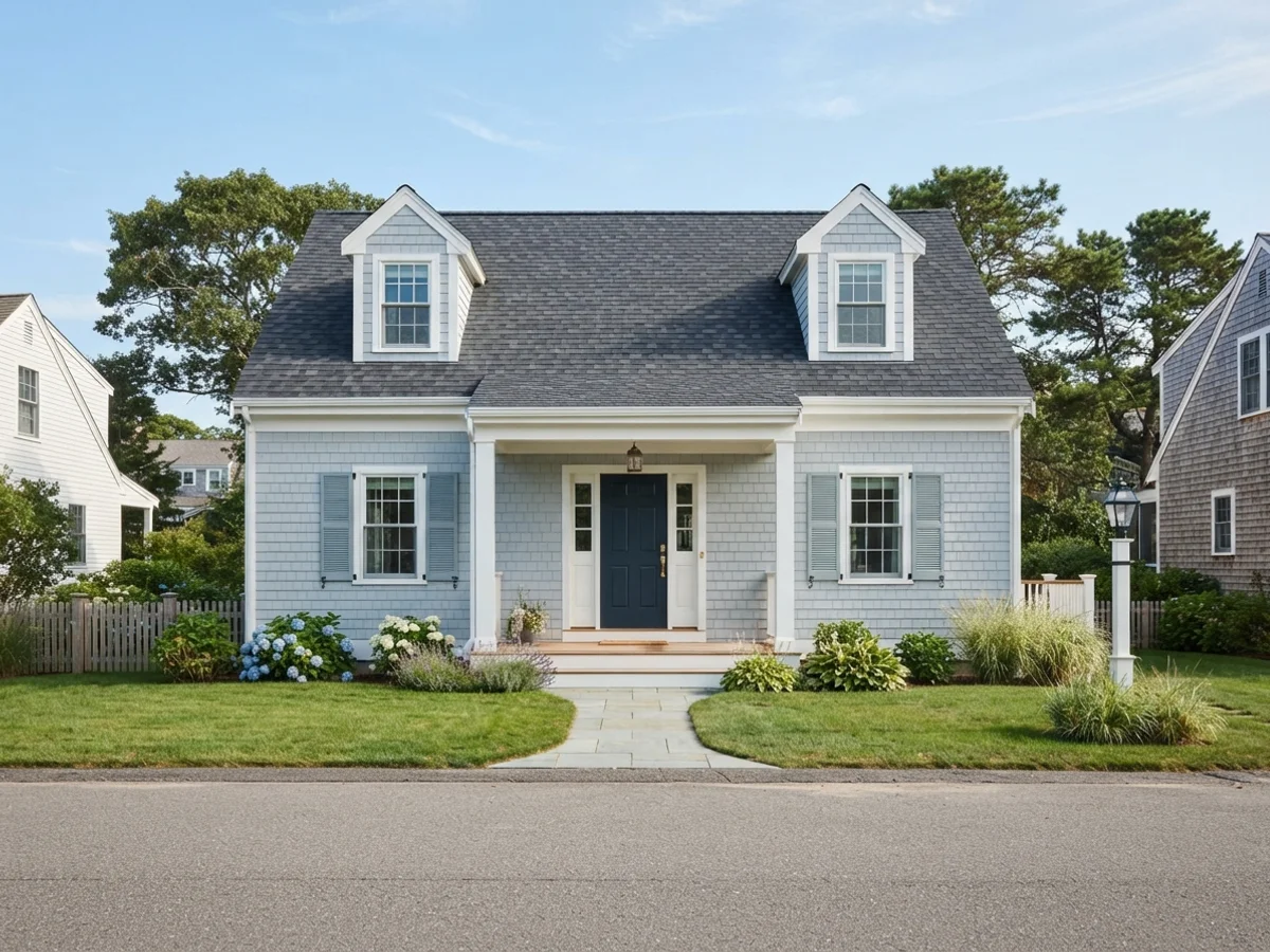
A gray-blue body mimics weathered cedar shingle without the twenty-year wait. Upward is the sweet spot — blue enough to read coastal, gray enough not to turn baby-blue in full sun. Crisp white trim keeps it from going moody. Repeat the navy on shutters or the door so the palette has a bass note.
Seafoam and Sage — the Soft Coastal Green
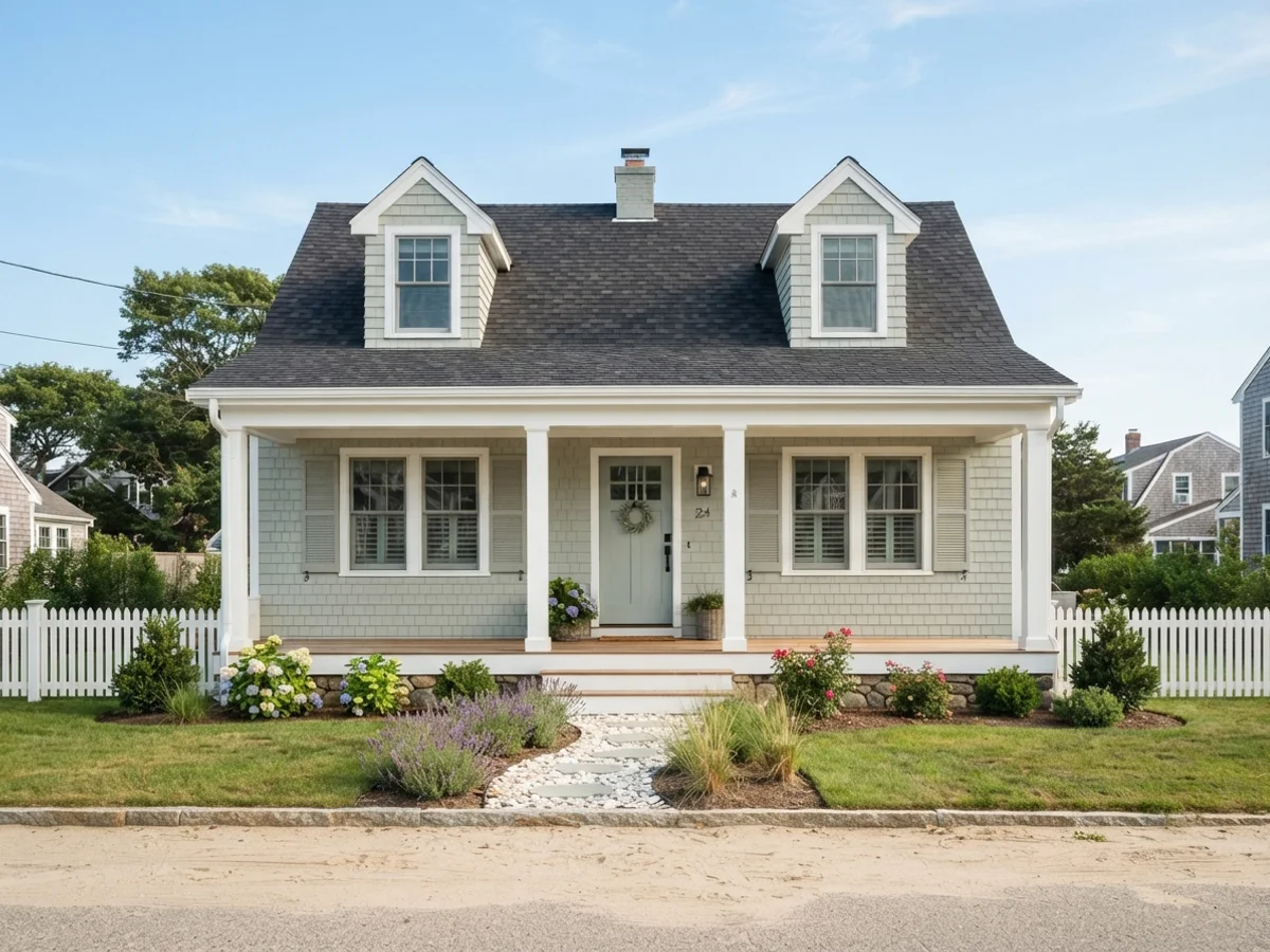
Sea Salt is the most-searched coastal paint color in America for a reason: it shifts between green, gray, and blue as the light moves — exactly the way shallow water does. On an exterior it stays quiet, never minty. Oyster Bay on shutters is the same family two steps darker. A Wythe Blue door keeps the green story going instead of fighting it.
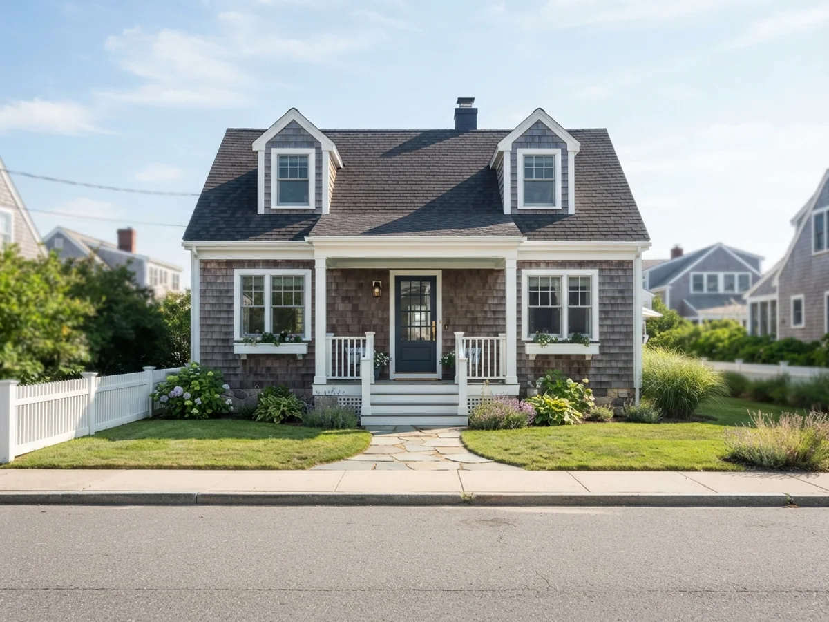
Navy Body, White Trim — the Nantucket Look
The one dark scheme that has earned its place at the shore. Hale Navy is a softened, gray-leaning navy that flatters shingle and lap siding alike. Generous Chantilly Lace trim is what makes it read "Nantucket" instead of just "dark house". Palladian Blue under the porch roof lightens the entry. Know the trade-off: a body this deep fades faster oceanfront — more on that below.
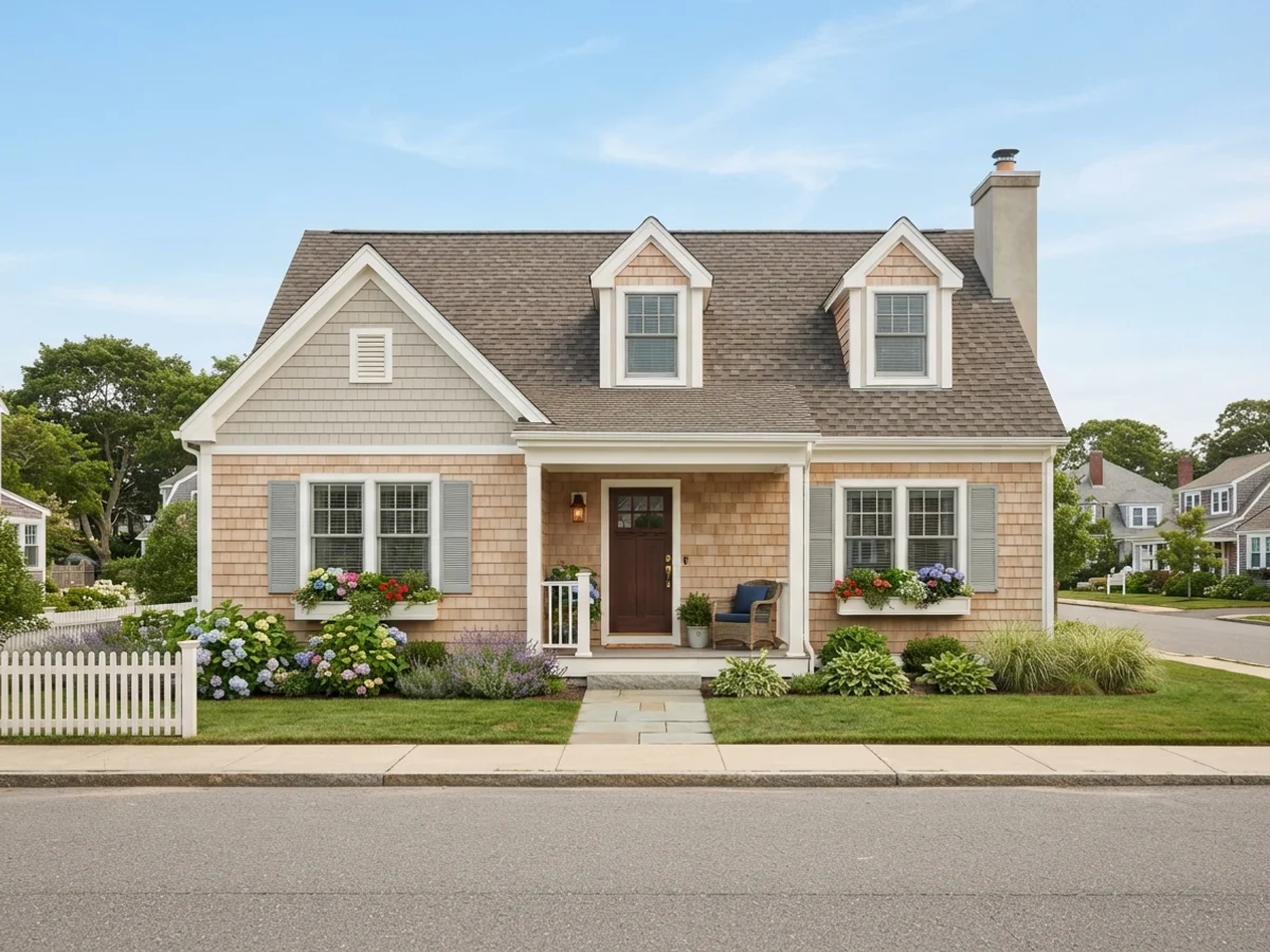
Sandy Neutrals and Driftwood
The dune-grass palette: sand-colored body, warm white trim, driftwood-gray shutters. It is the calmest scheme on this page and the most forgiving with age — sand tones hide salt film and dust between washes. Add a natural wood front door and a driftwood-stained deck, and the house looks like it grew out of the beach.
The Three-Color Rule, at the Shore
Body covers the siding. Trim covers the corner boards and casings. The door is the one dark anchor, and the porch ceiling is its own small decision.
Shutters should look like they could actually close — sized to the window, mounted with visible hinges or at least tight to the casing. Trim wants to be generous: wide corner boards and window casings in a bright white are what create the crisp, banded look in the Nantucket scheme. Skimping the trim width is the most common reason a navy house photo does not match the inspiration photo.
The front door is where wood earns its keep, too: a natural teak- or mahogany-toned door against a white or gray-blue body adds warmth the palette otherwise lacks. Try it on the front door page. Carry the thinking to the deck — driftwood and weathered-gray stains tie the deck to the sand instead of fighting the siding, and the deck stain visualizer previews those on your own boards.
Upload the photo. The visualizer paints each surface separately, and you can swap any one slot without starting over.
Five Beach House Looks, Rendered
Curated looks from our exterior render set. Each one opens the visualizer with its siding, trim and door colors already loaded.
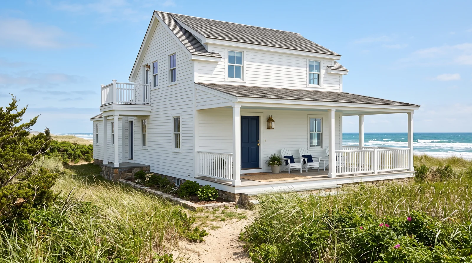
The pure-white cottage with a deep navy door, the safest and longest-lasting beach house scheme there is.
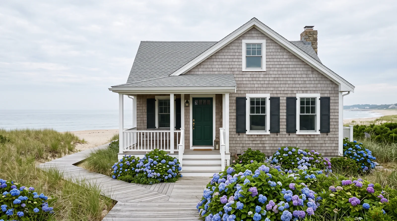
The Nantucket look in paint: a warm driftwood gray body with white trim and a deep green door.
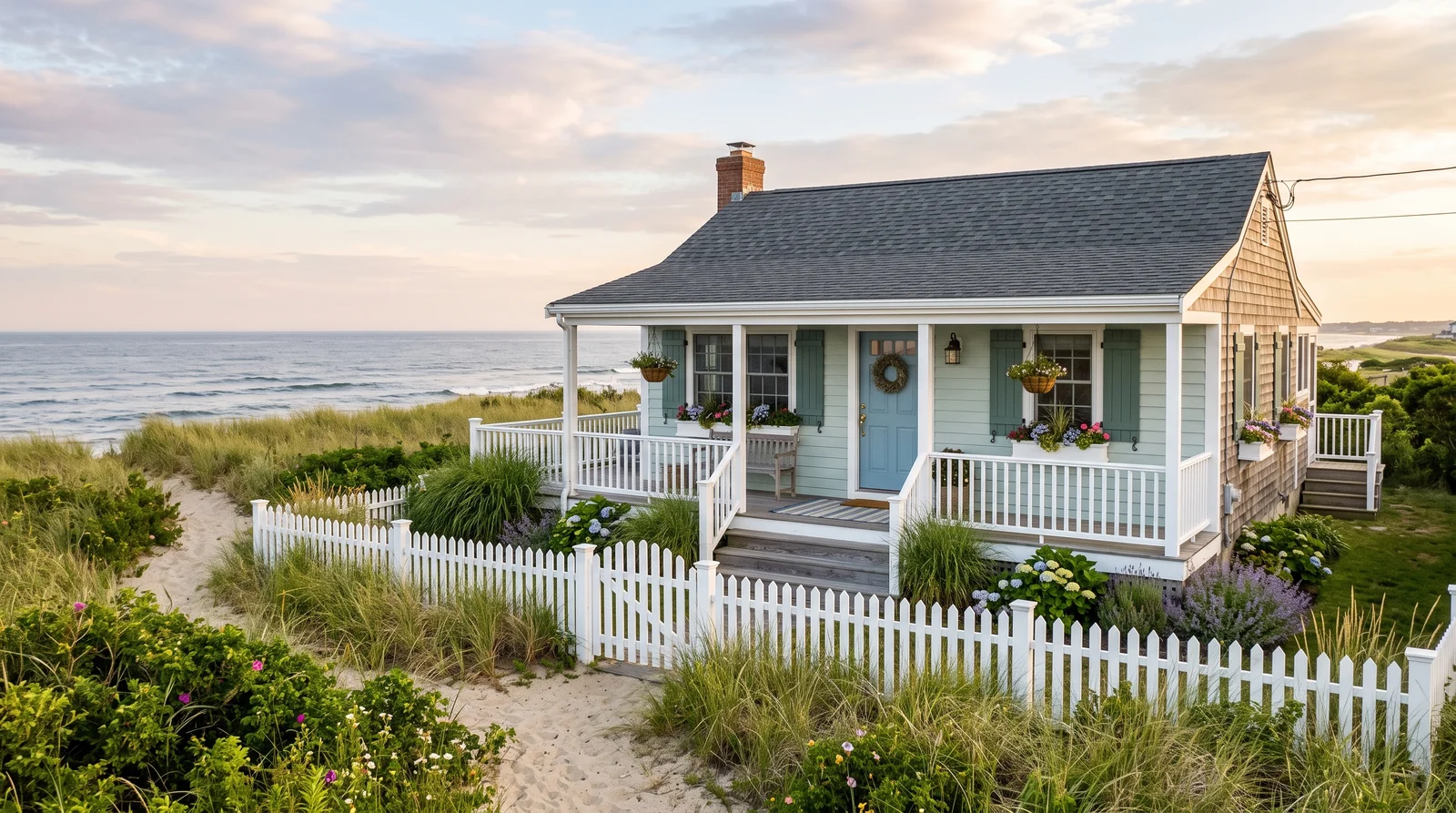
A pale green-blue body that looks like sea glass in the sun and stays quiet on a gray day.
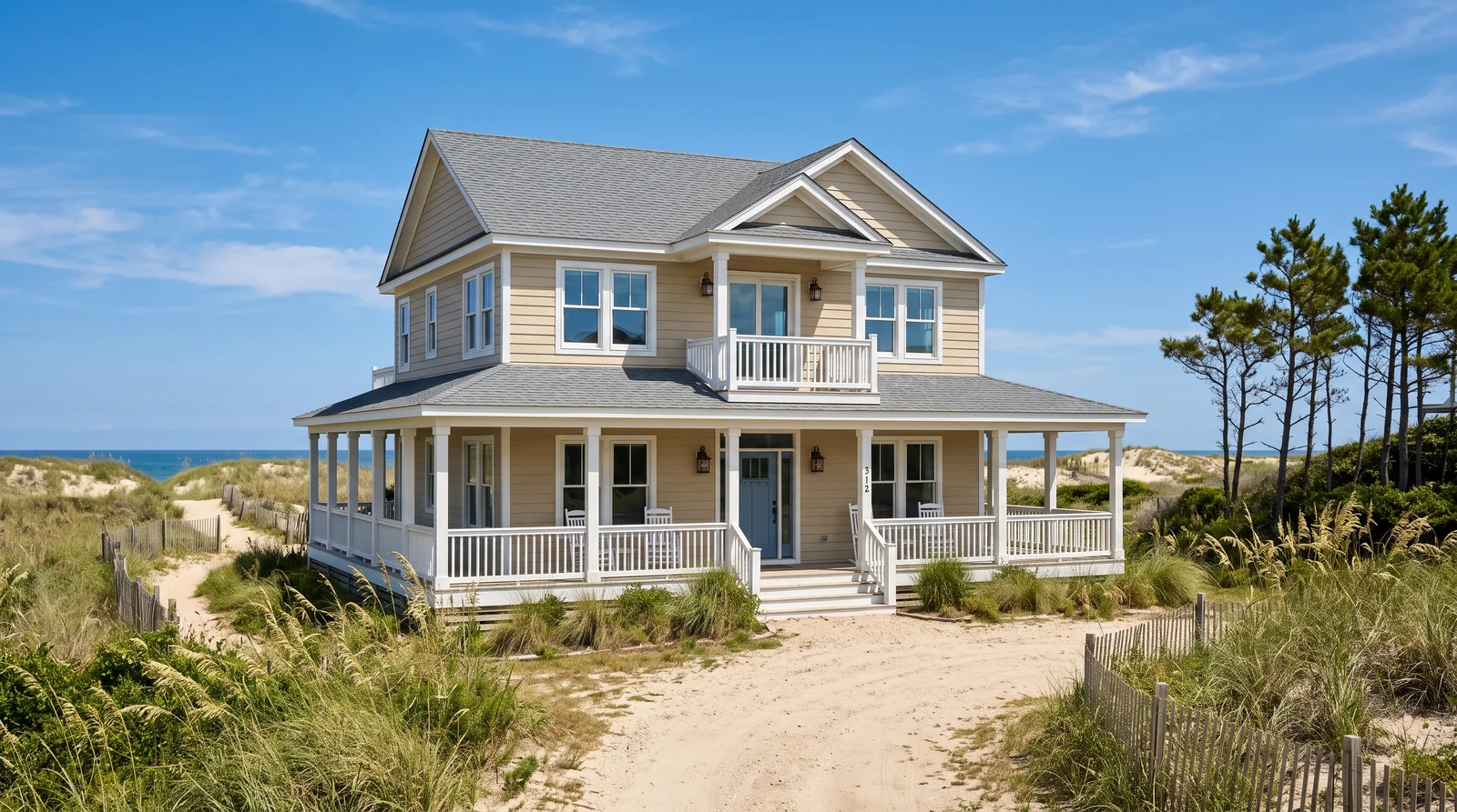
A warm sand body with bright white trim, the scheme that looks best when the yard is actually sand.
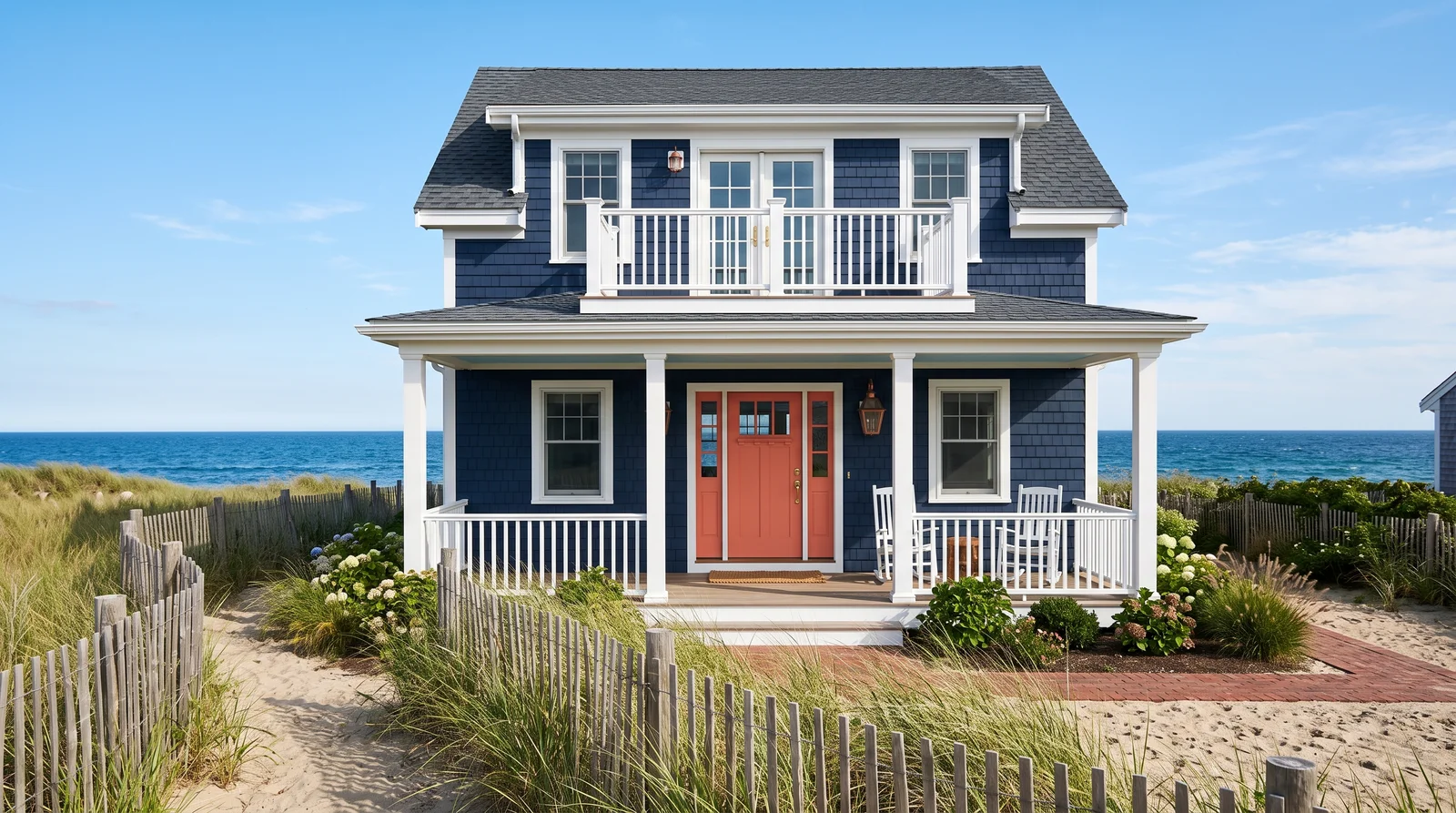
Deep navy siding with bright white trim and a coral door, the loud one on the street, with a shorter repaint clock.
From Chantilly Lace to Naval
Oceanfront and near-ocean, keep the body at an LRV of roughly 55 or higher. Pick a body from the light end, an accent from the dark end. Hover for the name, click to try it.
Sun, Salt, and LRV
Coastal paint fails from two directions at once — sun from above, salt spray from below. The four factors below decide how a color actually holds up at the shore.
UV + Salt Fade Fast
Dark colors absorb more UV, and salt spray accelerates it. Oceanfront, a deep body color fades two to three times faster than the same paint inland, worst on the south and water-facing walls.
LRV Is the Filter
Near-ocean, keep the body at LRV 55 or higher. Alabaster sits at 82, Sea Salt at 63, Accessible Beige at 58 — all clear the bar. A block or two inland you can go mid-tone.
Deep Color Is a Trade
Hale Navy sits at LRV 8, Naval at 4. Want that depth anyway? Buy a premium exterior line, expect a shorter repaint cycle, or confine the dark color to the door and shutters — an afternoon to redo, not a crew.
Grayed Colors Weather Best
A pure pastel blue or mint reads sweet, then reads faded — the gray in Sea Salt and Upward lets the color weather into itself instead. Satin on the body sheds spray and rinses clean; semi-gloss trim reads crisp against it.
Salt Is a Second Sun
UV attacks from above. Salt attacks from below, and it never really stops.
Spray lands on the siding, the water evaporates, and the crystals stay, pulling moisture out of the air and holding it against the film day after day. The paint never fully dries out — that is why a coastal repaint can blister and chalk in half the time the same product lasts inland, even on a wall the sun barely touches.
The counters are cheap and boring: rinse the seaward face with a garden hose a few times a year, no soap, no pressure washer, just get the crystals off. And spec a top-tier 100% acrylic exterior line — the resin is what you are paying for, and it flexes with the siding and sheds salt instead of absorbing it.
Budget for asymmetry, too. The ocean side of a beach house needs paint years before the street side — good painters quote them as separate jobs for exactly that reason. Plan colors that fade gracefully: the whites, sands, and grayed blues on this page lose a little depth and still look intentional, while a saturated color loses its argument.
Roof, Masonry, and the Neighbors
What separates a beach house from a suburban house painted blue is mostly detail discipline — and reading the things the paint cannot change.
A weathered silver shingle roof gets along with every scheme on this page. A strong brown architectural roof pushes you toward the sandy-neutral palette. A metal roof — silver or the coastal-classic pale green — pairs best with the white and gray-blue schemes. The same goes for stone, brick, and the neighbors: on a tight beach street, the houses either side of yours are effectively part of your palette, and a photo preview shows all of it in one frame.
If a beach-community HOA has a say, get the approved palette before falling for a scheme — it almost always leans this light, and a mockup on your own photo makes the approval request far easier to grant. If your house leans small and shingled rather than trimmed and formal, the cottage colors page is the closer blueprint; stucco coastal houses play by their own rules — see stucco house colors.
More Coastal Colors That Work
Eight more shore-tested colors that can replace any slot above without breaking the palette. Click one to try it as the body.
Beach House Color FAQ
Why do beach house colors fade faster than colors inland?
Dark colors absorb more UV, and both accelerate pigment breakdown. Add salt spray and reflected glare off water and sand, and a deep body color oceanfront fades two to three times faster than the same paint would inland — and unevenly, worst on the south and water-facing walls.
What LRV should an oceanfront house use?
Oceanfront and near-ocean, keep the body at an LRV of roughly 55 or higher: Alabaster sits at 82, Sea Salt at 63, Accessible Beige at 58. A block or two inland, with some tree cover, you can afford a mid-tone body without the same fade risk.
Why is the porch ceiling painted pale blue?
The pale "haint blue" overhead comes from the Gullah tradition of keeping restless spirits from crossing, and painters have kept it ever since because it reads as sky and cools the whole entry.
Should the front door be painted or left as wood?
A natural teak- or mahogany-toned door against a white or gray-blue body adds warmth the rest of the palette lacks. Try it against a painted color on the front door page before committing either way.
Related Styles and Surfaces
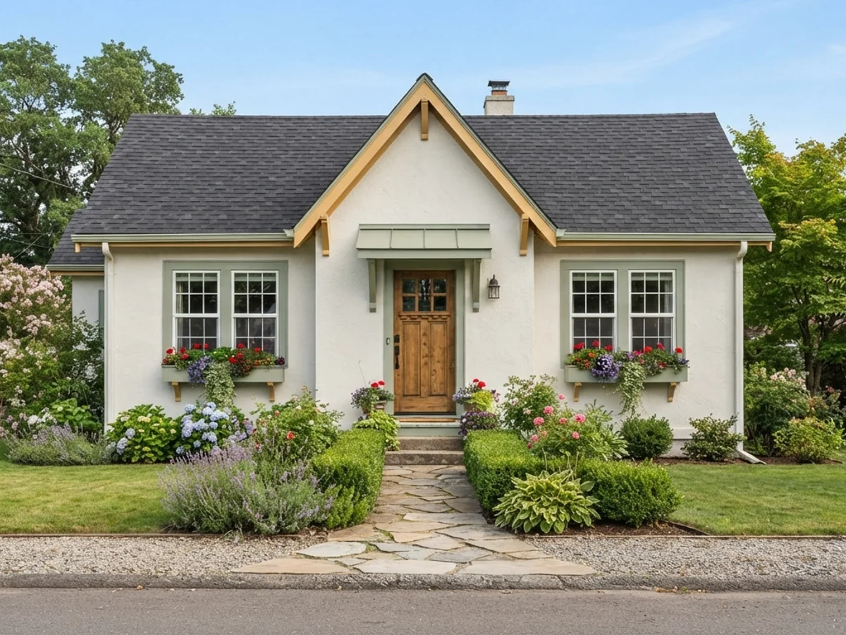
Soft, storybook palettes for small shingled houses
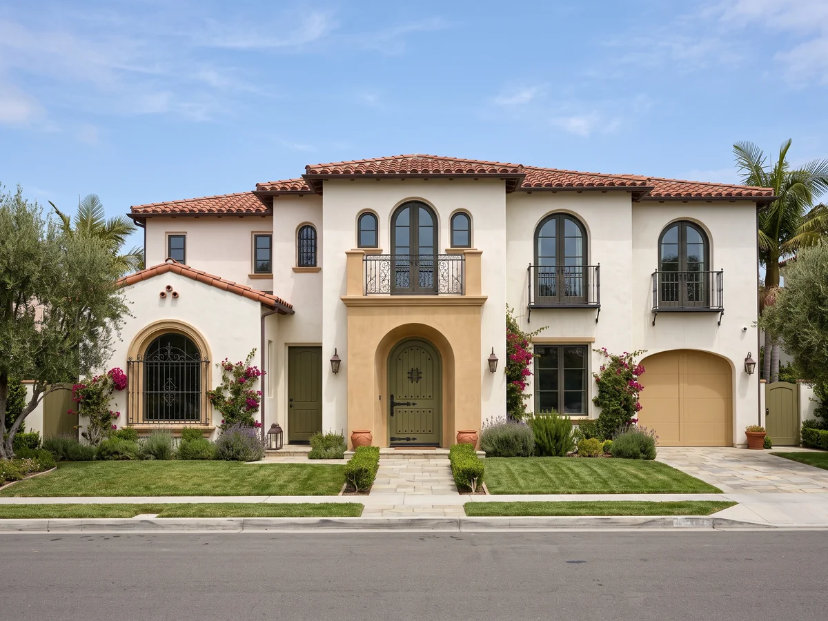
Coastal Mediterranean and smooth-plaster schemes
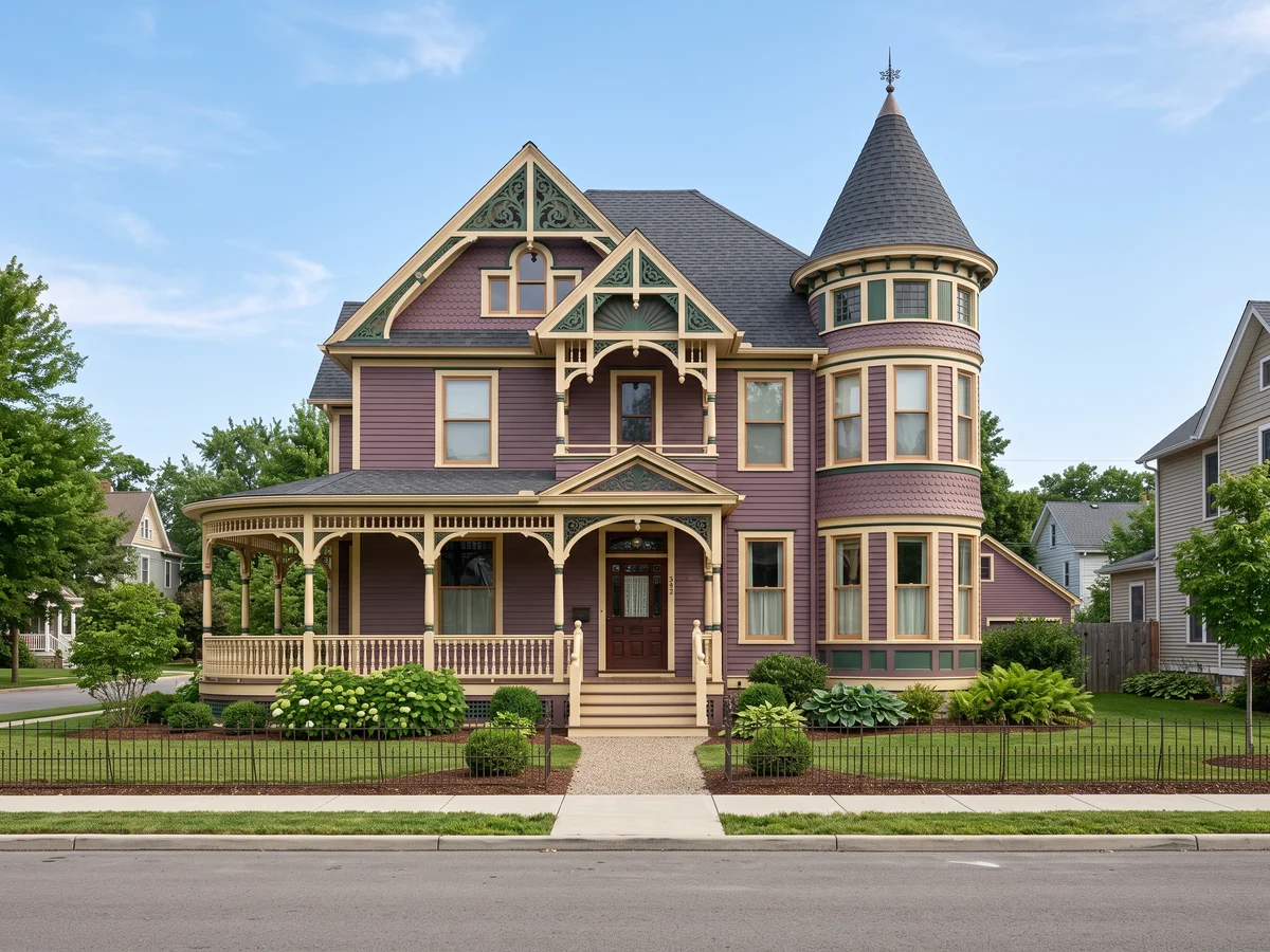
Multi-color painted-lady schemes
Five coastal schemes with real paint codes, previewed on a photo of your own house. Free to start.