Craftsman House Colors
Earthy body, contrasting trim, and a third, darker color on the window sash. Three colors minimum. Here are five complete schemes with real paint codes, and a way to see each one on your own bungalow.
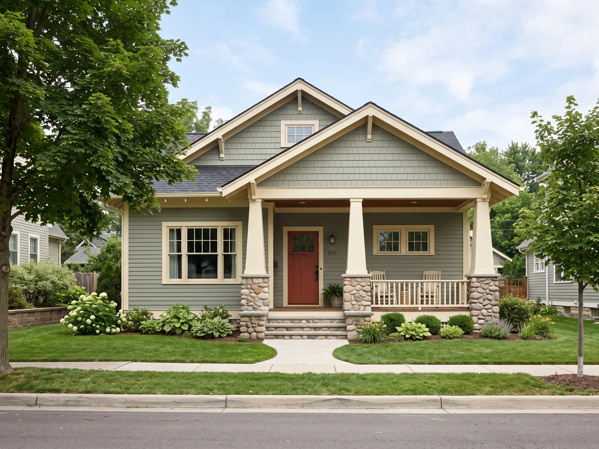
Five Complete Craftsman Schemes
Every one is a full body, trim, sash and door set from documented Arts and Crafts colors. Codes are exact. Screen swatches are approximations, so judge the scheme on a photo of your house, not on this page.
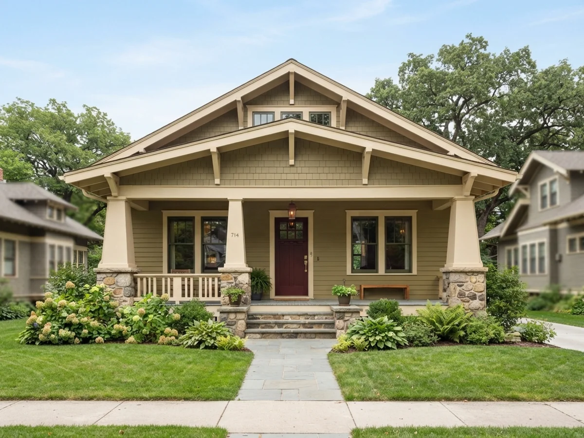
The Classic Olive Bungalow
The scheme most people picture when they hear "Craftsman": a muted olive body, deep cream on the trim and brackets, near-black green on the window sash, and an oxblood-red door. Renwick Olive is quiet enough to live on a whole house; Rookwood Dark Red reads as aged leather rather than fire-engine.
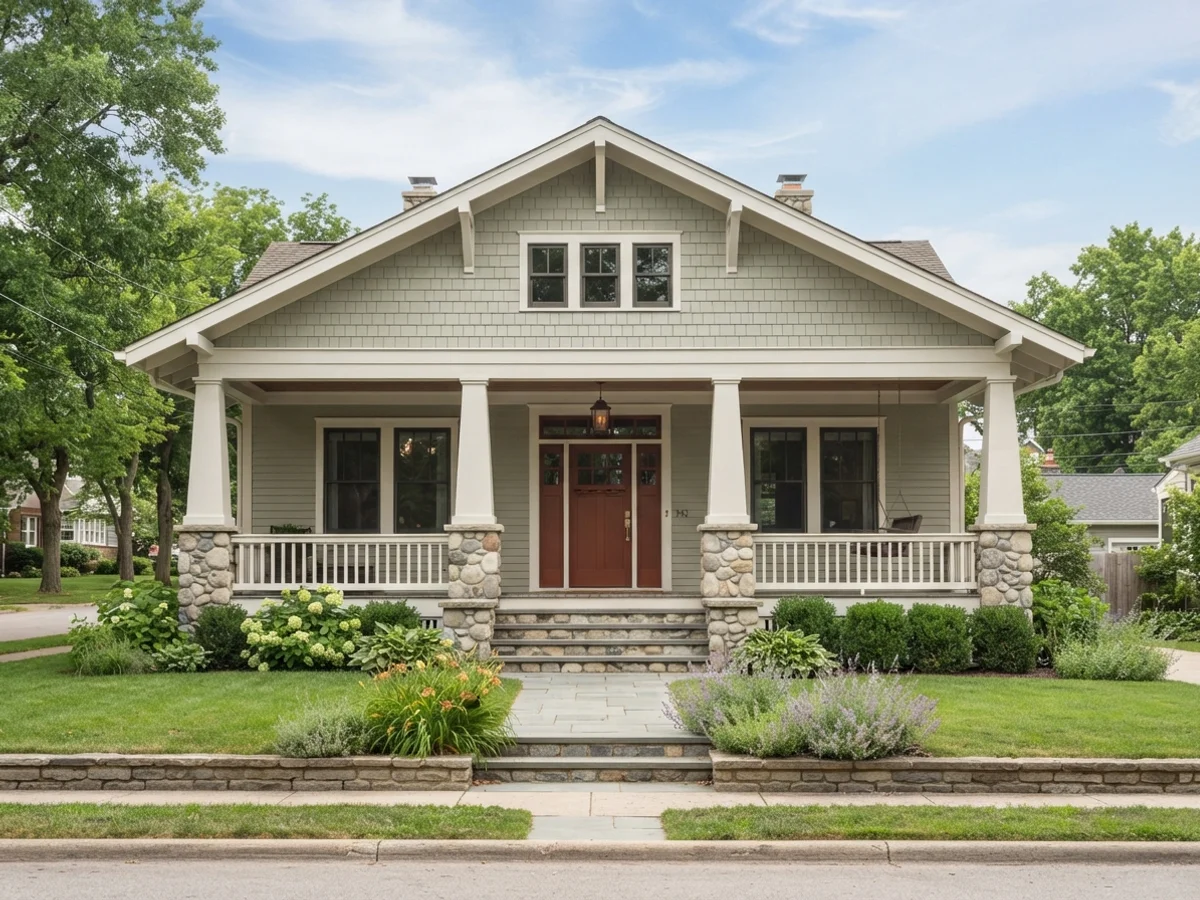
Sage, Warm White & Bronze
The gentlest scheme on this page and the easiest to sell to a whole household. Saybrook Sage is a gray-green that shifts with the light; Shoji White is warm without going yellow; Urbane Bronze on the sash gives the windows weight without the harshness of true black. The copper-red door keeps it from getting sleepy.
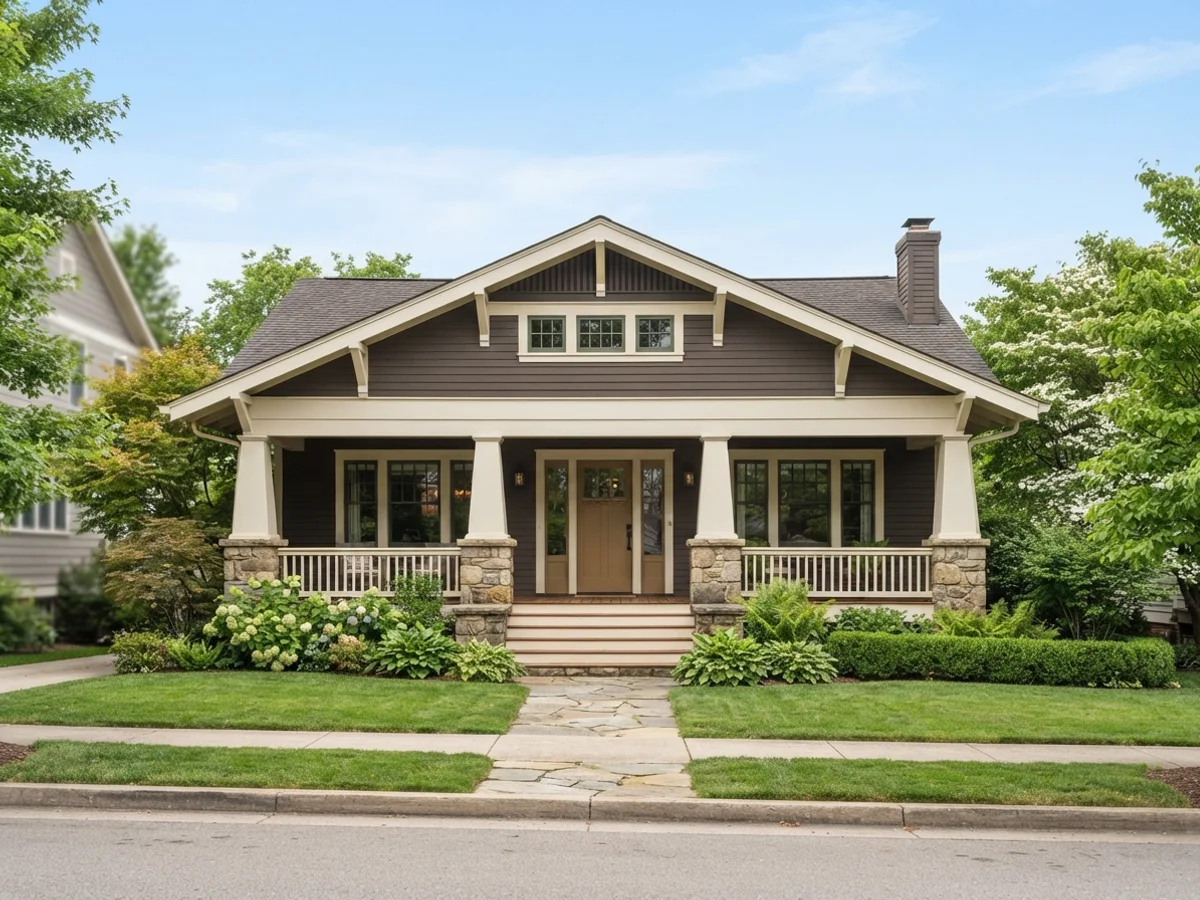
The Brown-Shingle Craftsman
For shingle-sided bungalows and anyone who wants the house to sit down into the landscape. A deep, gray-softened brown body with generous cream trim is a documented period combination; dark green sash and an antique-gold door are the two accents the era actually used with it.
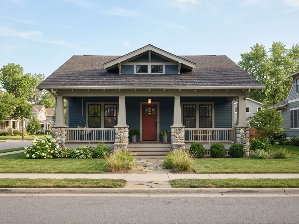
Muted Blue-Gray & Putty
Blue on a Craftsman has to be grayed way down or it stops looking like a Craftsman. Bunglehouse Blue — the name is not a coincidence — is a smoky slate blue built for bungalow bodies. Putty-toned trim keeps the contrast period-soft, black sash sharpens the windows, and a dried-blood red door finishes it.
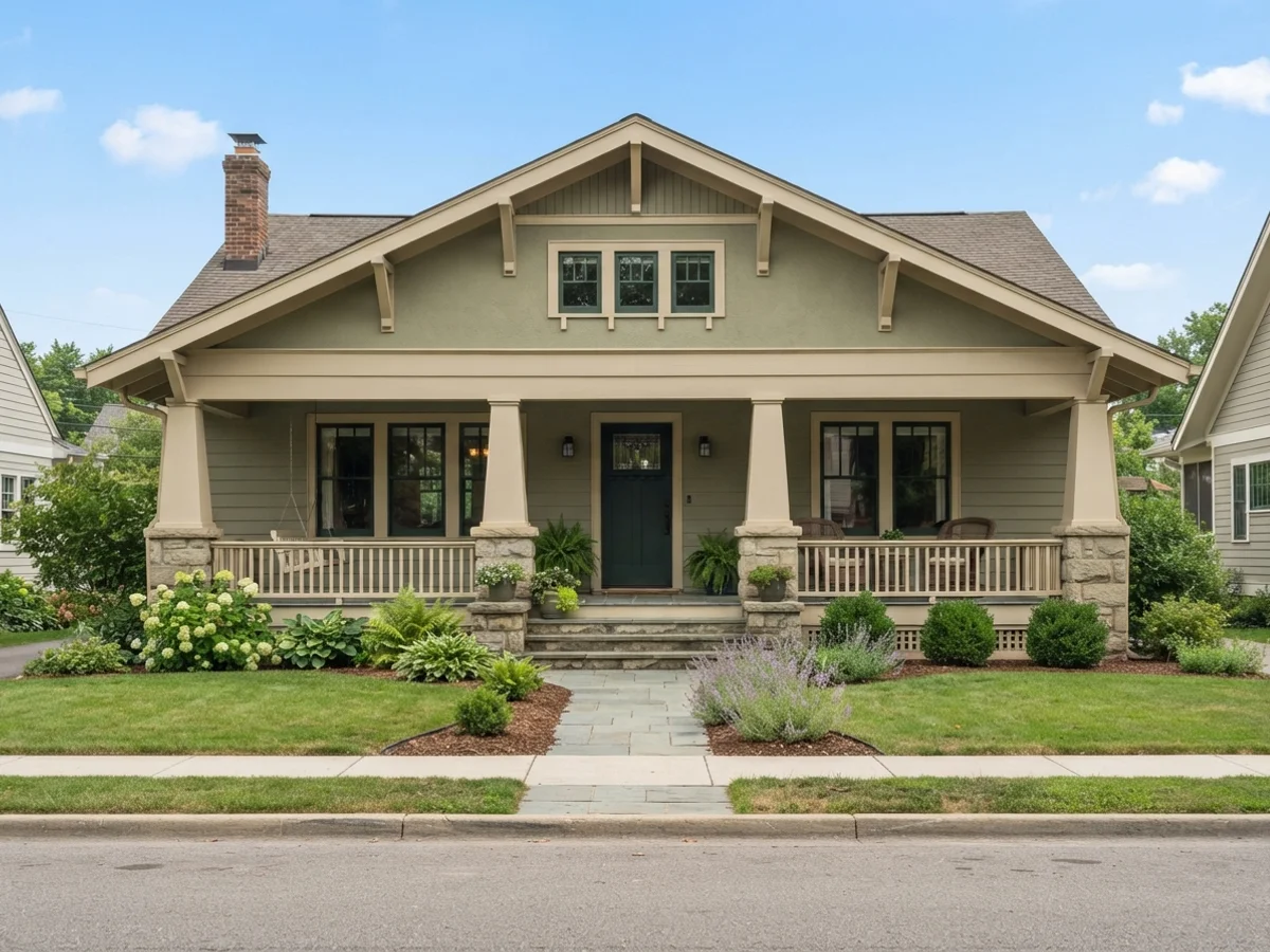
The Historic Green Trio
Green-on-green-on-green is the most historically loaded Craftsman move — the Arts and Crafts movement was obsessed with bringing the garden onto the house. A soft jade body, bottle-green sash, and a deep forest door are three distinct greens that read as one idea; sandy trim gives the eye a place to rest.
The Three-Color Rule, on the House
Body covers the siding. Trim covers everything that sticks out. Sash is the darkest color and lives only on the window frames. The door borrows the sash color or becomes a fourth.
The body color covers the siding or shingles. If the house changes material between floors, lap siding below and shingles in the gable, the two materials can take two related shades of the same color, one step apart. The trim color goes on everything that sticks out: fascia and bargeboards, corner boards, window and door casings, the brackets and knee braces under the eaves, and exposed rafter tails. The sash color is painted only on the movable window frames and muntins, almost always the darkest color on the house. Dark sash makes the glass read as deep and shadowed, the way these houses were meant to look.
The front door either borrows the sash color or becomes a fourth: oxblood red against a green body is the most classic move in the entire American exterior-color canon.
Upload the photo. The visualizer paints each surface separately, and you can swap any one slot without starting over.
Five Craftsman Looks, Rendered
Curated looks from our exterior render set. Each one opens the visualizer with its siding, trim and door colors already loaded.
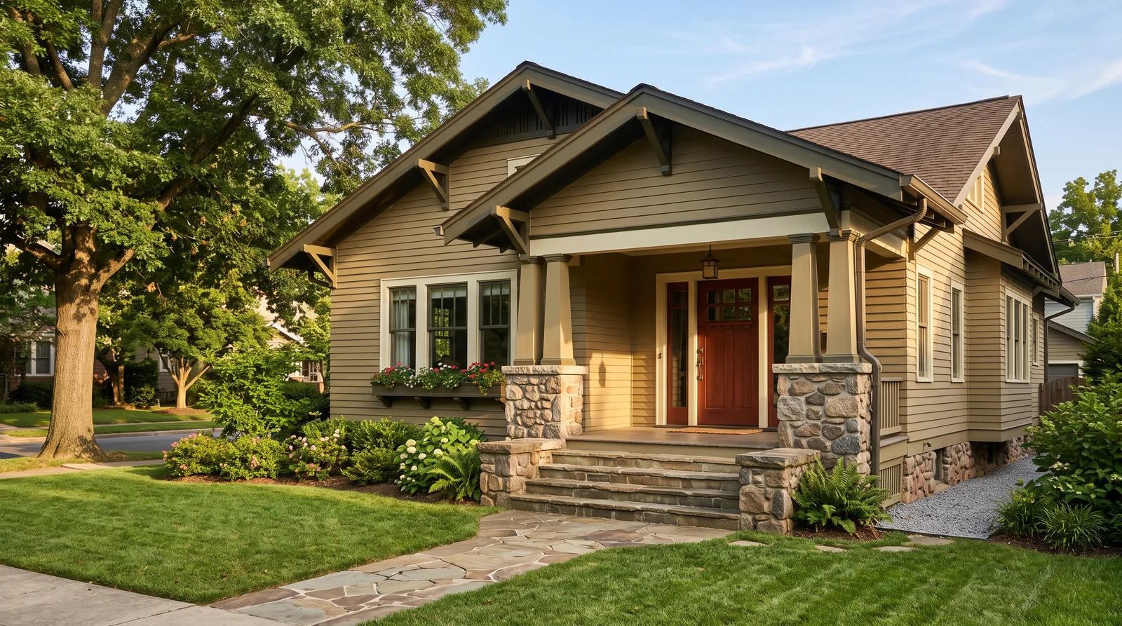
The textbook 1910s bungalow scheme: an olive-tan body, cream trim, and a dark green sash that makes the eaves pop.
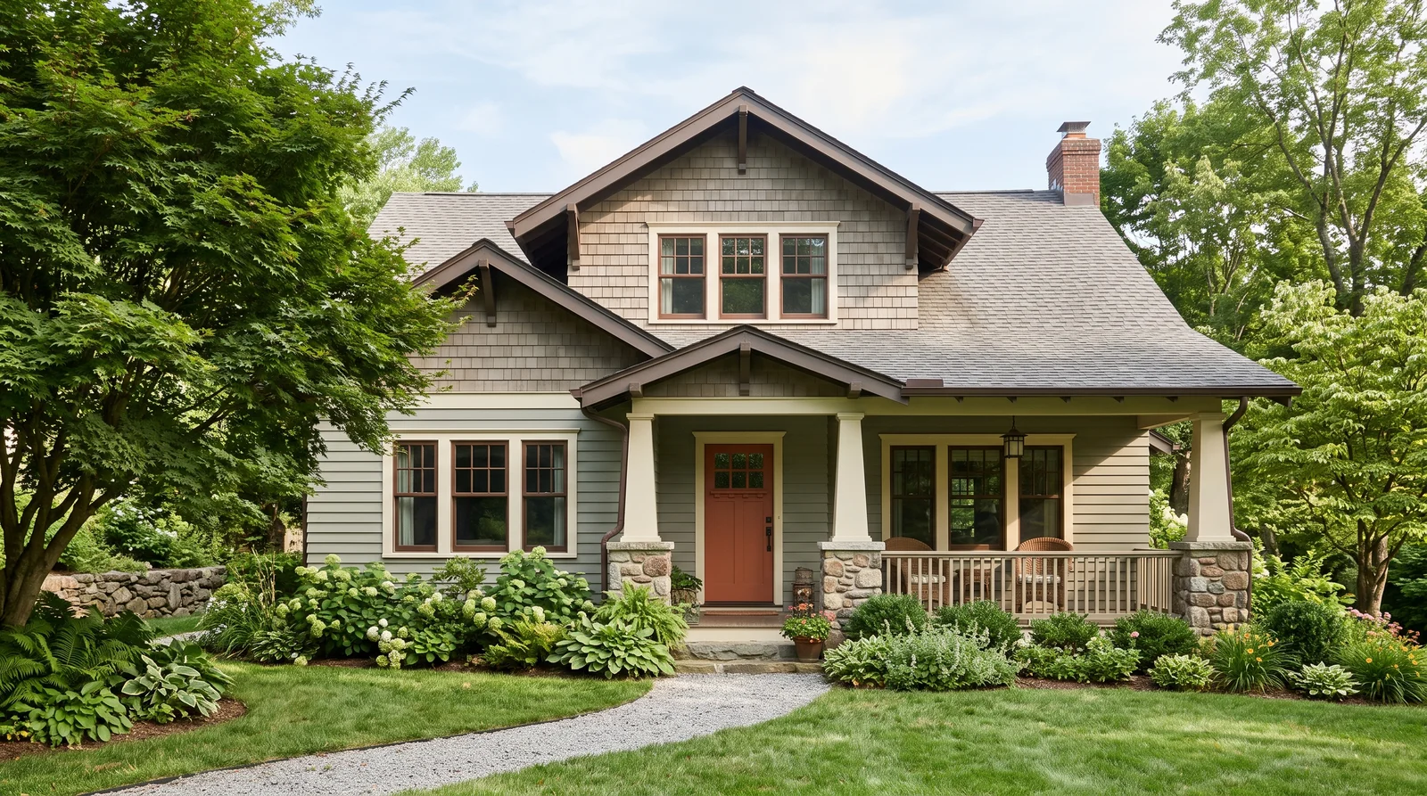
Soft grayed sage with creamy trim and a rust door, the most requested Craftsman scheme of the last ten years.
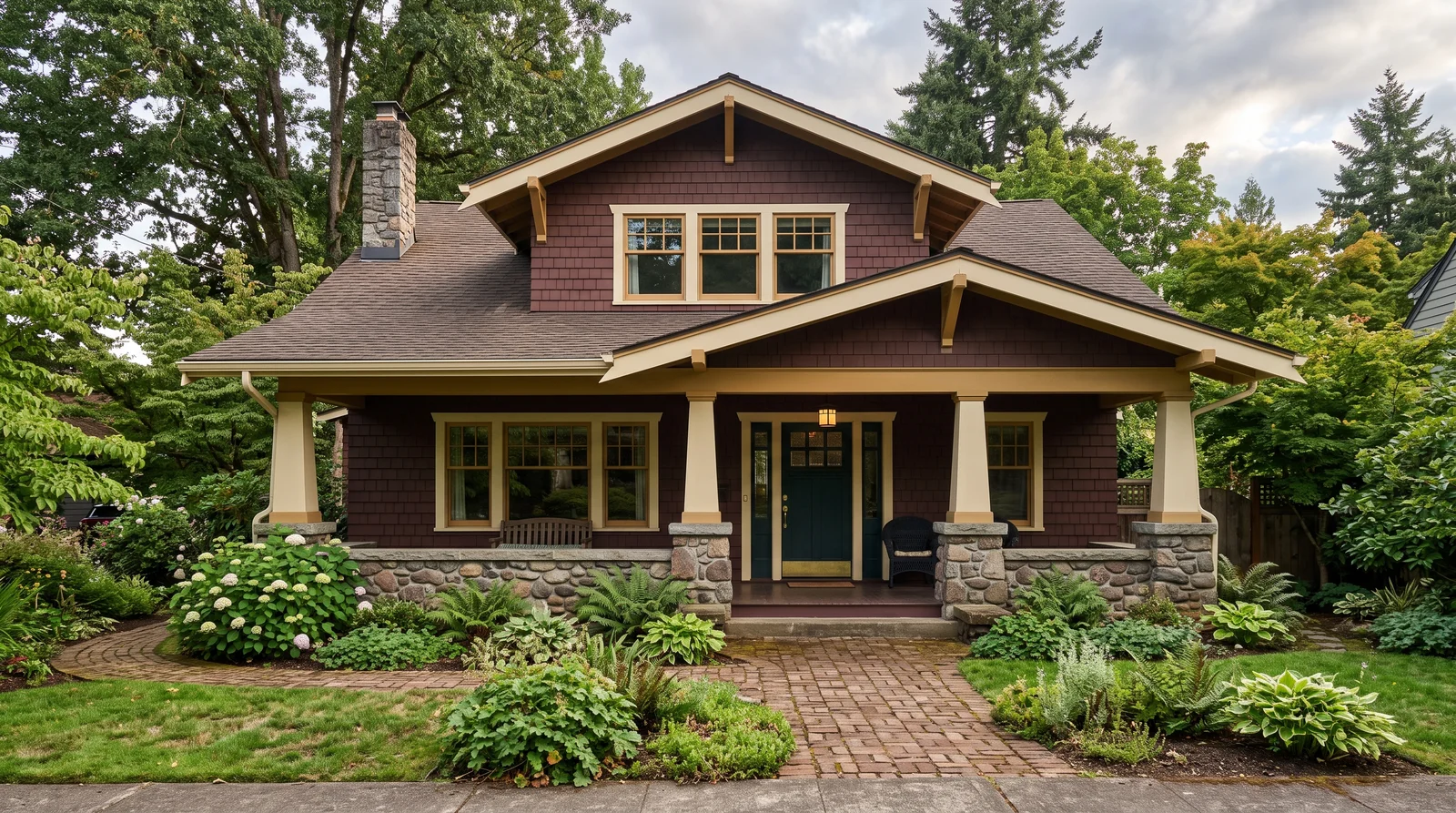
A deep oxblood-brown body with warm cream trim, straight out of a 1920s paint card.
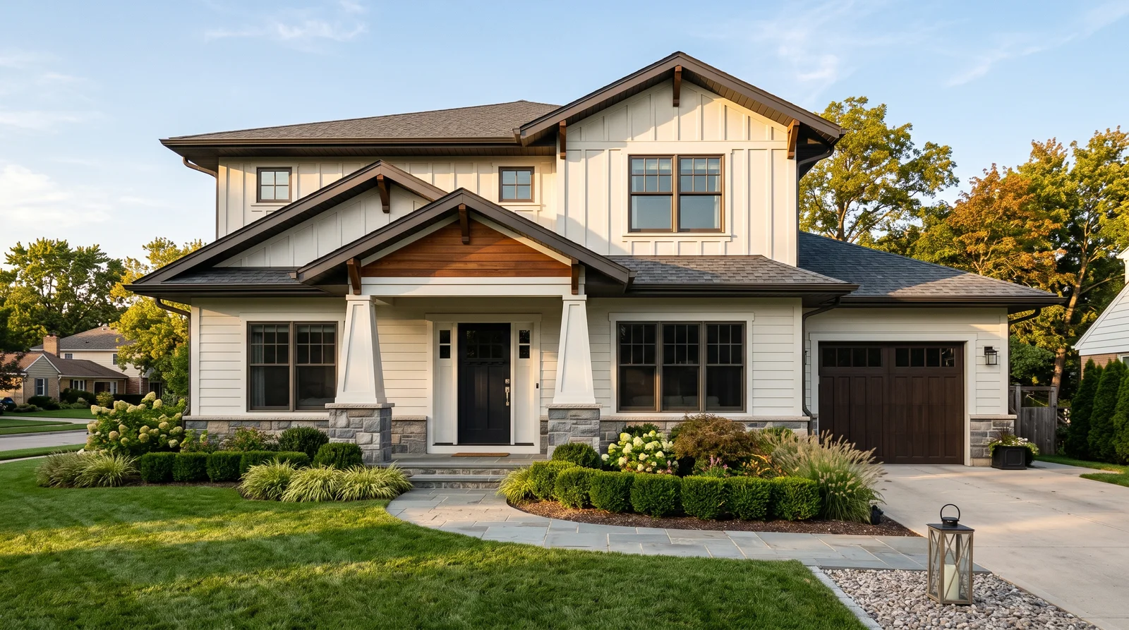
The new-build Craftsman look: a warm white body, crisper white trim, charcoal door and bronze structural details.
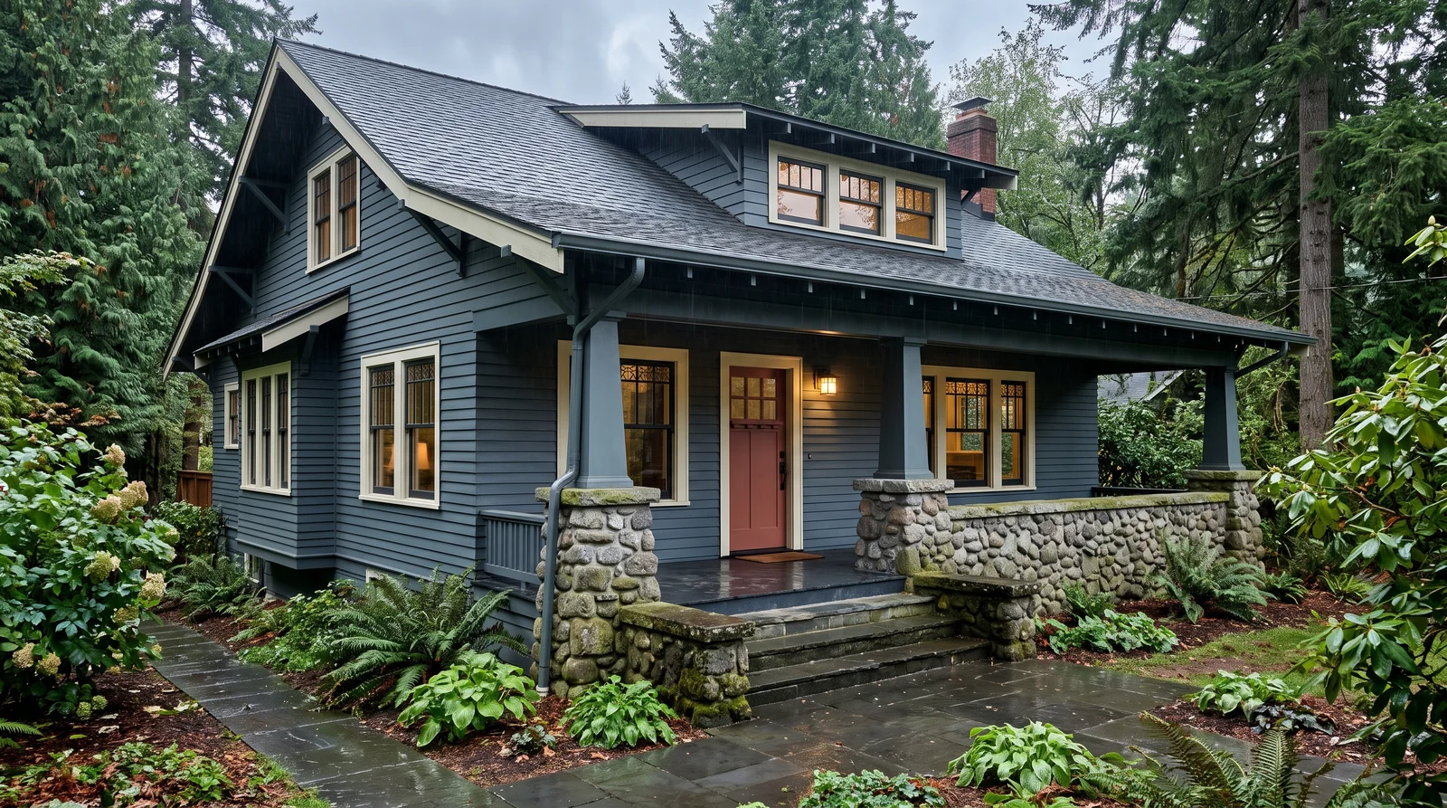
A deep historic blue-gray body with warm white trim and a clay-red door, quiet from the street and sharp up close.
From Cream to Bottle Green
Period body colors sit around LRV 10 to 35, where a modern greige might be 60. Pick a body from the middle, trim from the left, sash from the right. Hover for the name, click to try it.
Historic vs. Modernized Craftsman
Both work because both keep the three-color structure. What breaks the house is flattening it to one color plus white.
Muted, close in value
- Mid-tone earthy body, LRV 10 to 35
- Cream trim, never bright white
- Dark green or black sash
- Right for a documented 1920s bungalow or a historic district
Contrast pushed harder
- Near-black or deep bronze body; Urbane Bronze SW 7048 is the poster child
- Or the reverse: a warm white body with brackets picked out in Bronze Green
- Keeps all three slots, so it still reads as Craftsman
- Judge a whole dark body on a photo first
Same caution as the porch piers: think hard before painting any of the brick or river stone. On a Craftsman the masonry is part of the color scheme. Pick body and trim colors that flatter it instead; if the brick truly fights everything, test a painted version on a photo first and live with it on screen for a week. Our brick house page covers working with, and around, existing brick.
On the timeline, Craftsman color sits between two worlds: quieter and earthier than the exuberant schemes of a Victorian, far more layered than the single-body-color approach of the ranch houses that followed.
The Porch, in Four Small Choices
A Craftsman without its porch is a cottage with brackets. Done right, it reads as one room from sidewalk to front door.
Floor
Porch-and-floor enamel, not wall paint. A deep gray or the body color two steps darker.
Ceiling
The soft haint-blue tradition, or the trim cream. A flat white ceiling is the one answer the era never gave.
Piers
Stay bare. Stone and clinker brick were chosen as permanent color; painted masonry is a one-way door.
Steps
Treads take the floor enamel so the porch flows down to the path. Risers take trim.
More Craftsman Colors That Work
Eight more documented Arts and Crafts colors that can replace any slot above without breaking the period logic. Click one to try it as the body.
Craftsman Color FAQ
Do Craftsman houses really need three colors?
Yes. Body, trim and a darker sash is the formula the style was built on. Skipping the third color is the single most common way a bungalow gets painted wrong: the woodwork disappears and it reads as a cottage with brackets.
What is the sash color, exactly?
Only the movable window frames and muntins. It is almost always the darkest color on the house, which makes the glass read as deep and shadowed. Trim covers everything that sticks out: fascia, corner boards, casings, brackets and rafter tails.
Can I paint the stone or brick porch piers?
You can, but think hard first. The masonry was chosen as permanent color and paint on porous stone is forever. Pick body and trim colors that flatter it instead, and test any painted version on a photo before deciding.
Is a dark body color period-correct?
Period body colors sit around LRV 10 to 35, so a deep bronze body is closer to history than a pale greige. The modern high-contrast take works because it keeps the three-color structure. Judge it on a photo first: deep colors look better on a real house than on a chip.
Related Styles and Surfaces
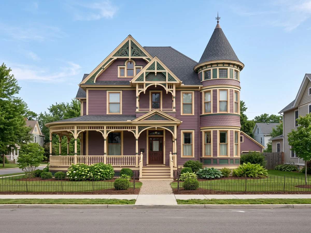
Multi-color painted-lady schemes
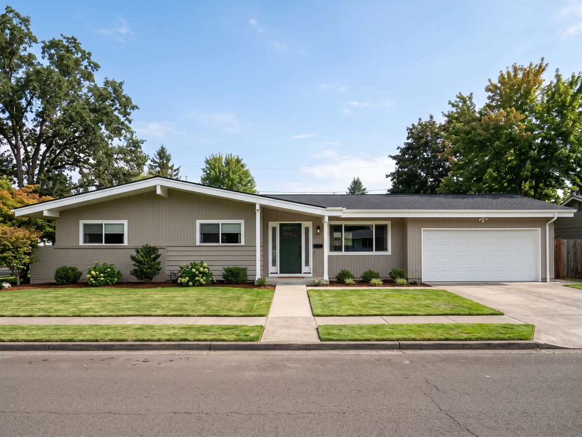
Single-body colors with presence
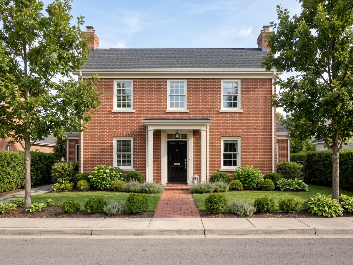
Trim and door colors that flatter brick
Five schemes with real paint codes, previewed on a photo of your own house. Free to start.