Victorian House Colors
Victorians were never meant to be white. The style is polychrome by design — body, trim, window sash and brackets each get their own color. Five complete schemes below, real codes on every swatch, and a way to see each one on your own house.
Five Victorian Schemes That Work
You cannot judge a four-color scheme from paint chips — the colors only make sense on the house, in their places. Every one below is complete and buyable, real codes on every swatch, mostly from Sherwin-Williams' Historic collection.
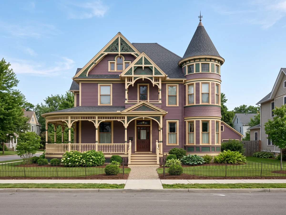
The Classic Painted Lady
The scheme most people picture when they hear "Victorian": deep green body, warm cream trim, oxblood red on the details. Dramatic but never loud, because every color in it is muted — this is the palette San Francisco's famous rows are built on. Rookwood Dark Green covers the siding, Roycroft Vellum runs on all trim boards and porch posts, Shutter Green takes the window sash, and Rookwood Dark Red is saved for brackets, spindles, and the front door.
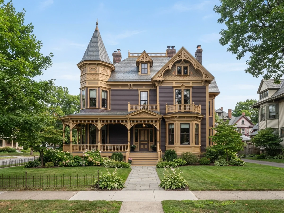
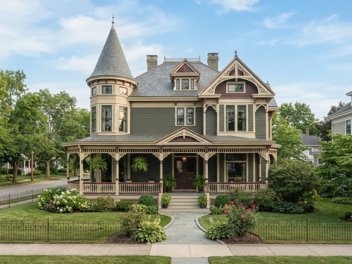
Plum & Gold
The romantic Victorian. A grayed plum body keeps the purple sophisticated instead of sweet; straw-gold trim warms the whole facade. This pairing shows up constantly on Queen Annes in older streetcar neighborhoods, and it photographs beautifully at dusk. Expressive Plum covers the body, Downing Straw runs on trim and porch, Plum Brown takes the sash so the windows recede, and Rookwood Antique Gold picks out bracket faces and gable ornament.
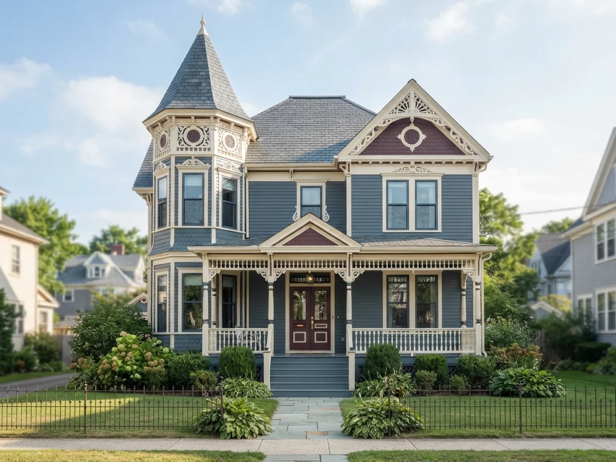
Slate Blue & Burgundy
Cool body, warm accents — the tension is the point. Dusty slate blue reads calm and historic; the burgundy details give the gingerbread a reason to exist. Of the five schemes here, this one flatters the widest range of roof colors. Smoky Blue covers the siding, Classical White runs on trim, Needlepoint Navy takes the sash, and New London Burgundy covers the door, brackets, and porch skirt details.
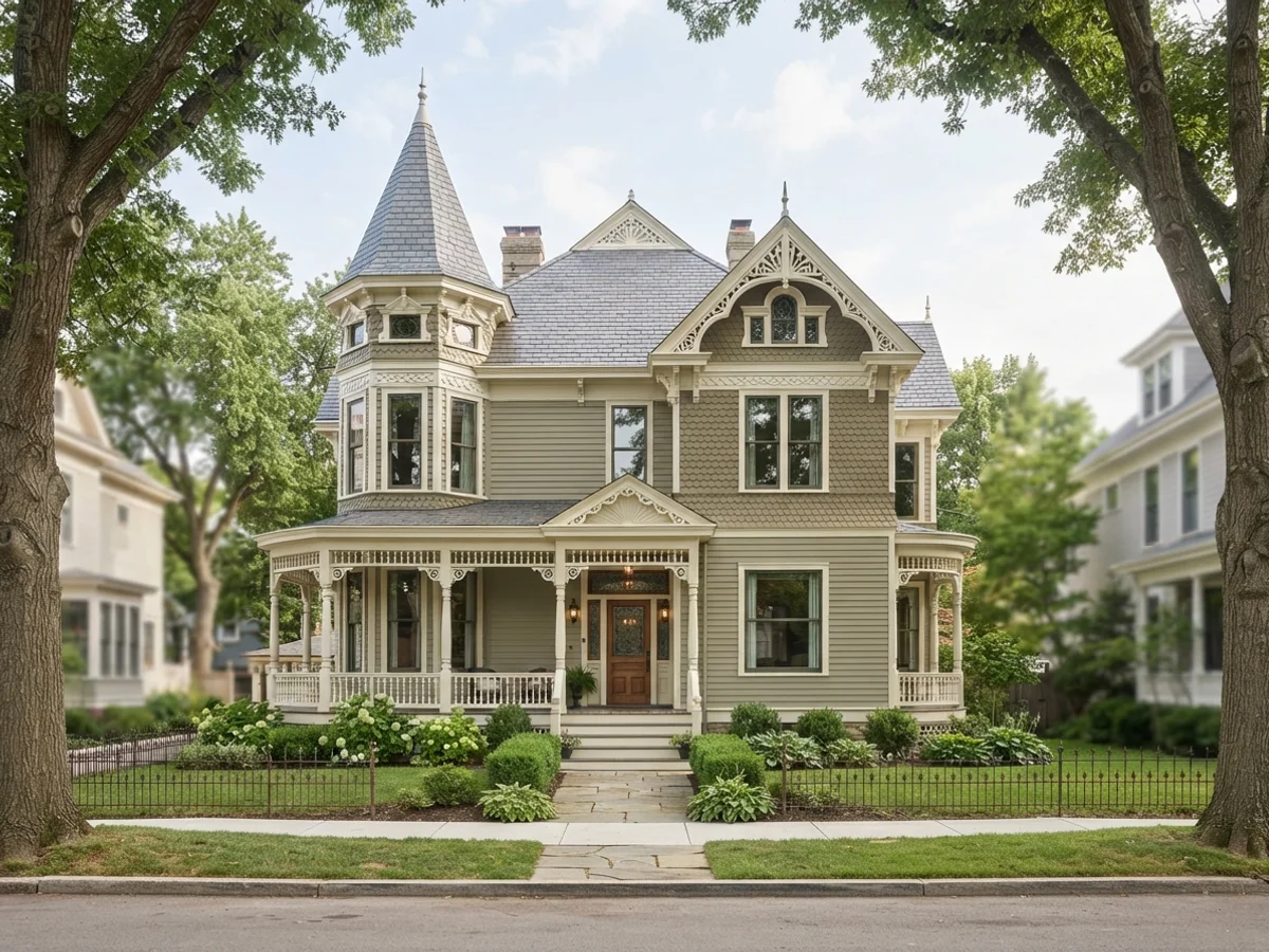
Sage, Olive & Cream
The most historically faithful palette on this page — Victorians leaned hard on green earth tones. Two closely related greens (light sage body, deeper olive on gables or the lower story) plus cream trim: the full polychrome effect with almost no risk. Sage covers the main body, Renwick Olive takes the gable shingles or lower story, Navajo White runs the trim, and Roycroft Bronze Green covers the sash and door — the darkest value on the house.
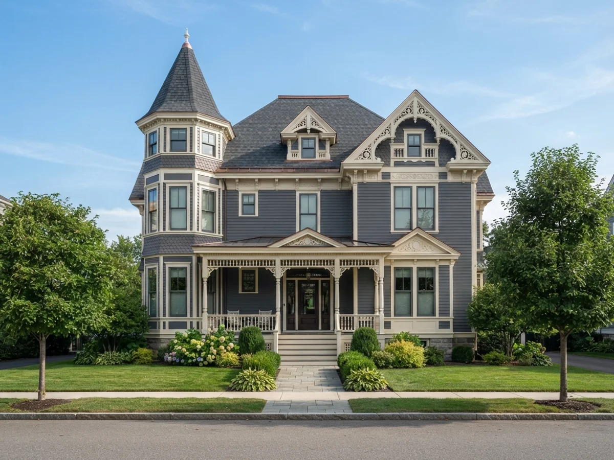
The Restrained Two-Color Victorian
For the color-shy, or for HOA streets. Slate-gray body, soft white trim — still unmistakably Victorian, because the architecture does the talking. One "cheat" third color on the sash keeps the windows from disappearing into the trim. Downing Slate covers everything that is siding, Classical White covers everything that is trim — posts, corner boards, brackets, gingerbread — and Roycroft Pewter takes the sash only. Nobody will count that as a third color, but the windows will thank you.
The Four Layers of a Victorian
Body, trim, sash and accent each pick out one layer of the architecture. Get the layers right and even a modest Victorian reads as a Painted Lady.
Body is the siding — clapboards and shingles. On a Queen Anne with a shingled gable or a different texture on the lower story, that second texture can take a second, related body color; the sage-and-olive scheme above does exactly this. Trim is everything that frames: corner boards, window and door casings, fascia, porch posts, railings. Keep it the lightest value on the house, so the frame reads as a frame.
Sash — the movable part of the window that holds the glass — gets its own color. The period rule: sash goes darker than the trim, often nearly black. A dark sash turns each window into a deep, glossy void. It is the single cheapest trick for making a Victorian look expensive, and the first thing restorers fix on a house that was blanket-painted white.
Accents are where the third and fourth colors live: bracket faces under the eaves, spindlework and gingerbread, incised carvings, the porch skirt, and the front door. The discipline that keeps a polychrome scheme elegant instead of circus-like is simple: accents highlight carved and turned details only, and every accent color repeats at least twice somewhere on the facade. The porch ceiling is the one place to break ranks — a pale, gray-leaning sky blue, never bright baby blue, is the traditional move, with trim-matching cream as the safe alternative.
Upload the photo. The visualizer paints each surface separately, and you can swap any one slot without starting over.
Five Victorian Looks, Rendered
Curated looks from our exterior render set. Each one opens the visualizer with its siding, trim and door colors already loaded.
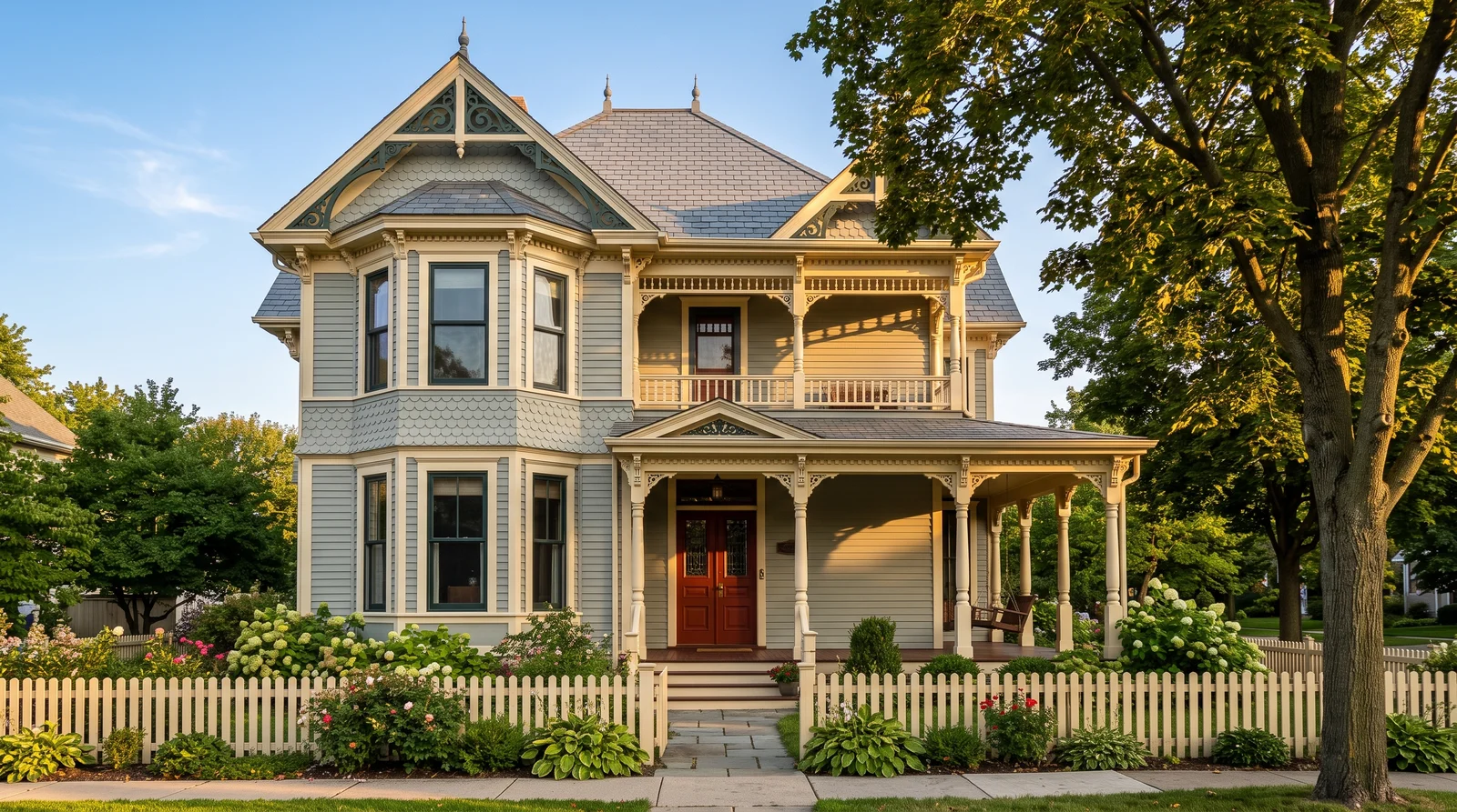
The full five-color treatment, where a calm sage-gray body lets the red door and dark green sash do all the shouting.
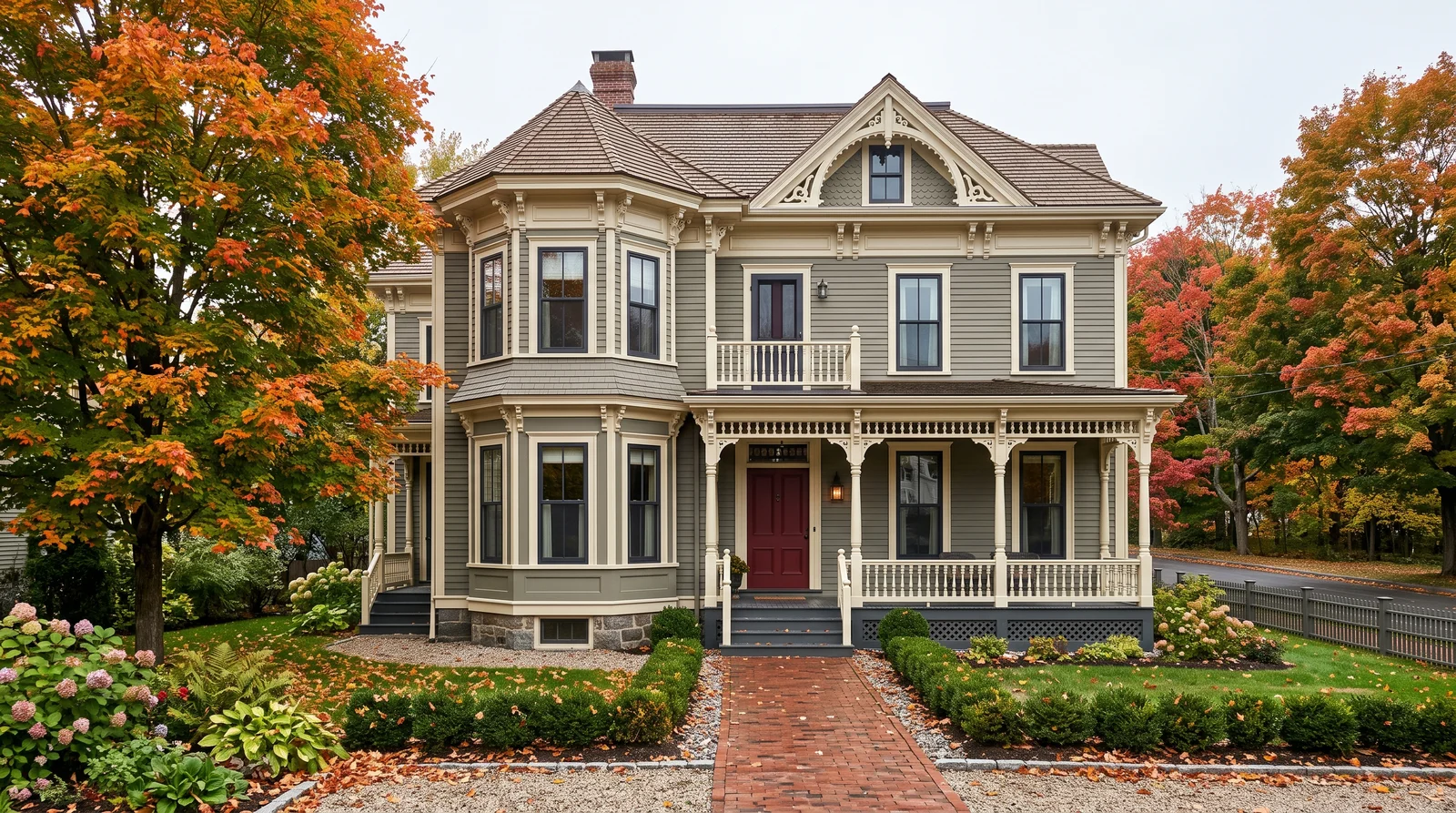
The scheme an 1885 painter would actually have mixed: drab olive-gray body, cream trim, oxblood door.
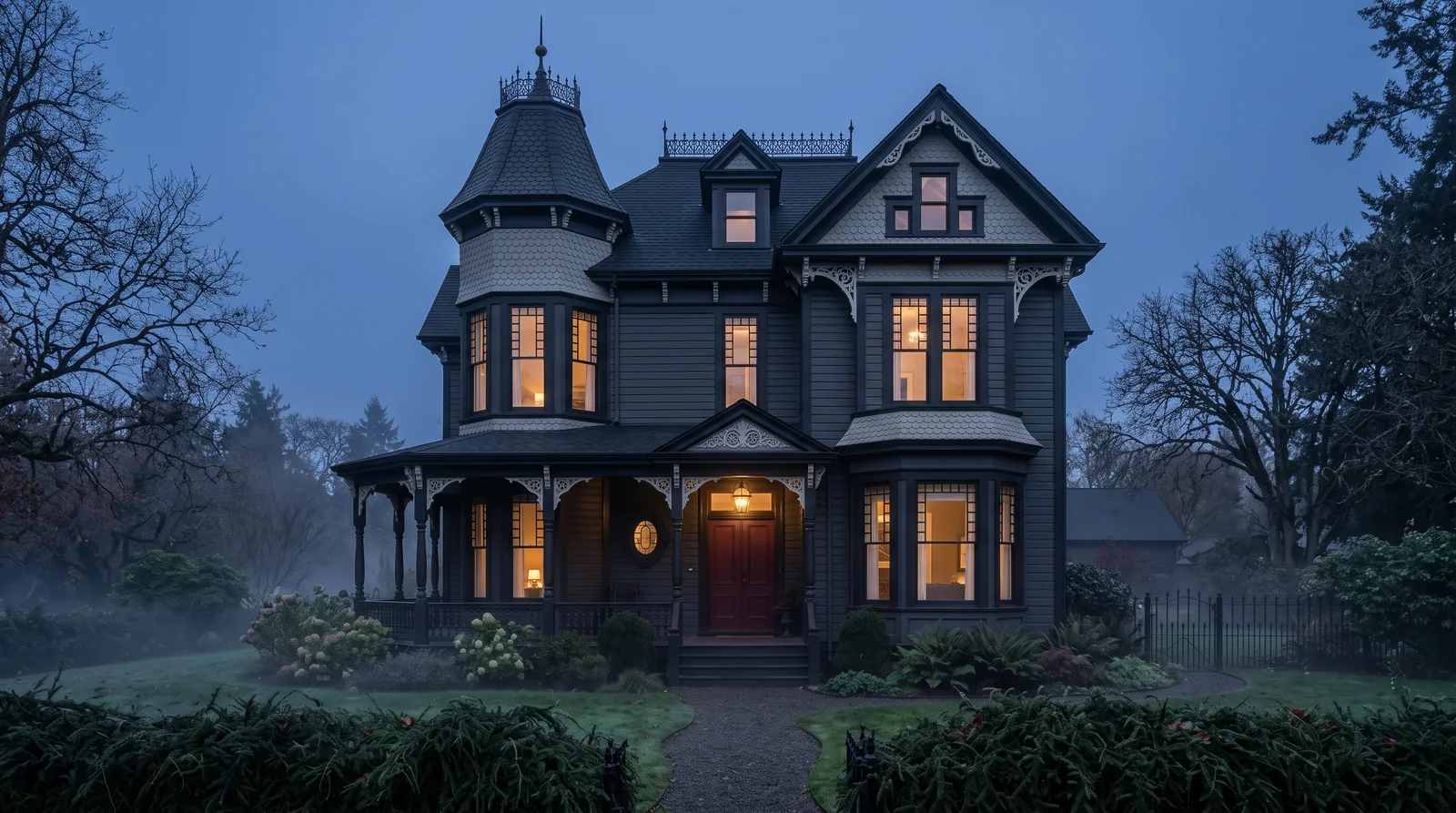
Near-black on everything except the door and the picked-out gingerbread, so the carving reads like lace.
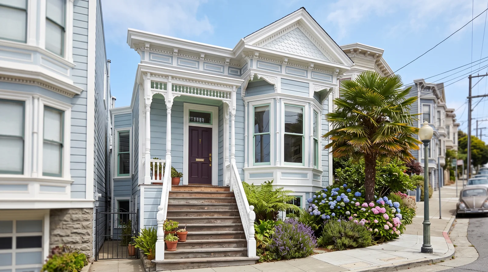
Pale blue body, bright white trim, plum door — the postcard look from Alamo Square, softened for a normal street.
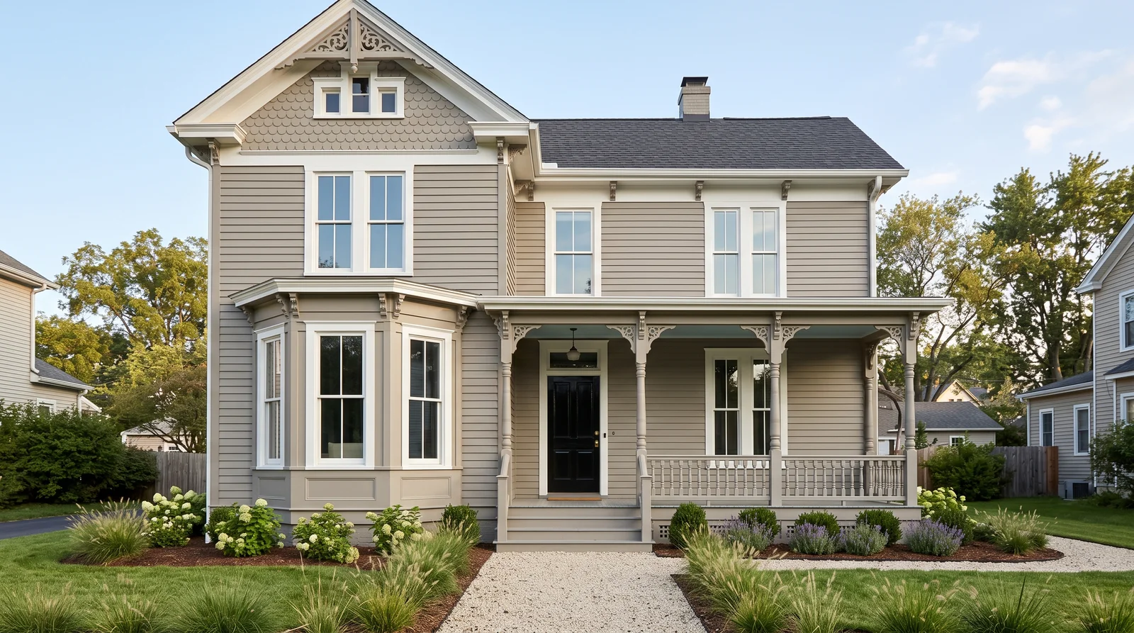
Everything in one warm greige, white only on the window casings, so the carving reads as texture instead of pattern.
From Navajo White to Rookwood Dark Red
Every scheme on this page stays inside a muted, earth-toned range — nothing candy-bright. Pick a body from the middle, trim from the light end, sash and accents from the dark end. Hover for the name, click to try it.
Historic Accuracy vs. the Modern 'Painted Lady'
Both are called Victorian. Only one is what the era actually painted.
Muted Earth-Tone Range
- Nineteenth-century pigments came from earth minerals: olive, ochre, oxblood, slate, grayed blue — rich, but muted
- This is the range every scheme on this page stays inside
- Right for a documented Victorian or a historic district
The Bright "Painted Lady"
- Candy-bright pinks and turquoises are a 1970s San Francisco invention — even the term "Painted Lady" only dates to a 1978 book about that city's houses
- Charming there; on most streets a bright multi-color Victorian reads theme-park rather than historic
- Stay inside the muted range and you can be adventurous with the number of colors and still look correct
Budget for the Brushwork, Not the Paint
A Victorian repaint is not priced by the gallon. The paint on a four-color scheme costs a few hundred dollars more than a one-color job; the labor costs thousands more. Every place two colors meet is a line someone cuts by hand — around every bracket, every spindle, every pane.
Keep It to Three Colors
Three colors, placed well, read as five — a dark sash against light trim against a mid-value body gives the facade more apparent depth than a fourth color ever can.
Reuse the Sash Color
Let the sash color do double duty on brackets, porch skirt, and incised carvings instead of opening another can — one color to buy, one touch-up to store, one thing to match in ten years.
Paint by Exposure
The south and west faces take the sun and the weather, and fail years before the sheltered sides. Put them on their own shorter schedule and let the north face ride until it actually needs the work.
More Victorian Colors That Work
Eight more documented period colors — plums, slate blues, deep greens, warm creams, burgundies — that can step into a body, sash, or accent role without breaking the look.
Victorian Color FAQ
Do Victorian houses need multiple colors?
Yes. The style is polychrome by design — three to five colors, each picking out its own layer of the architecture: body, trim, window sash, brackets, spindlework. Give those layers their own colors and a busy old house becomes the "Painted Lady" everyone slows down to look at.
What color should the window sash be?
Darker than the trim, often nearly black. A dark sash turns each window into a deep, glossy void — the single cheapest trick for making a Victorian look expensive, and the first thing restorers fix on a house that was blanket-painted white.
Are bright "Painted Lady" colors historically accurate?
Not really. Real Victorian palettes were quieter than most people expect — nineteenth-century pigments came from earth minerals, so the period range is olive, ochre, oxblood, slate and grayed blue. The candy-bright versions are a 1970s San Francisco invention; the term "Painted Lady" only dates to a 1978 book.
Why do Victorian repaints cost so much?
It is priced by the brushwork, not the gallon. Every place two colors meet is a line someone cuts by hand around a bracket, a spindle, or a pane, and a gabled Queen Anne carries hundreds of those lines. Three colors placed well can read like five and cut real hours off the job.
Related Styles and Surfaces
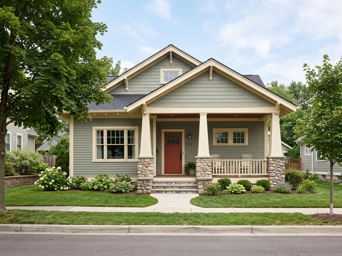
Quieter, earthier three-color schemes
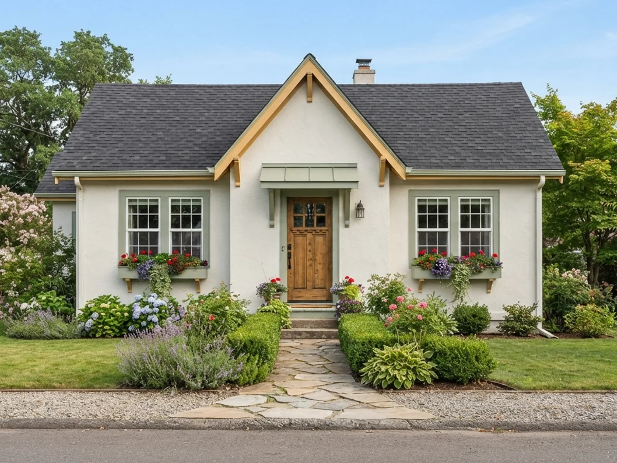
Soft, storybook palettes for a simpler porch
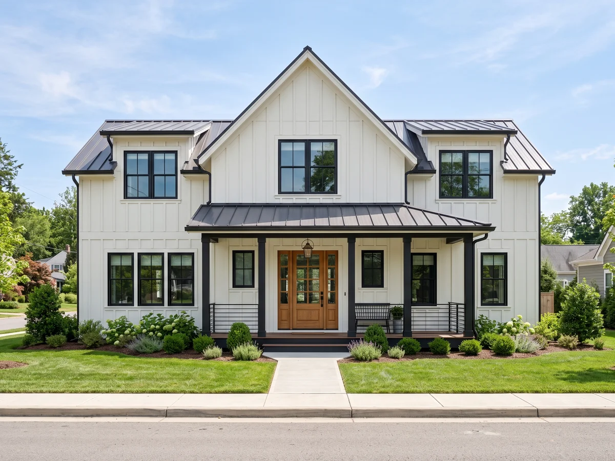
Crisp white bodies and black windows
One photo of your house, every scheme on this page — free to start.