Cottage Exterior Colors
Cottage color is soft, low-contrast, and a little imperfect on purpose — the opposite of crisp white-and-black farmhouse. Five complete schemes below, real paint codes on every one, and a way to preview them on a photo of your own house.
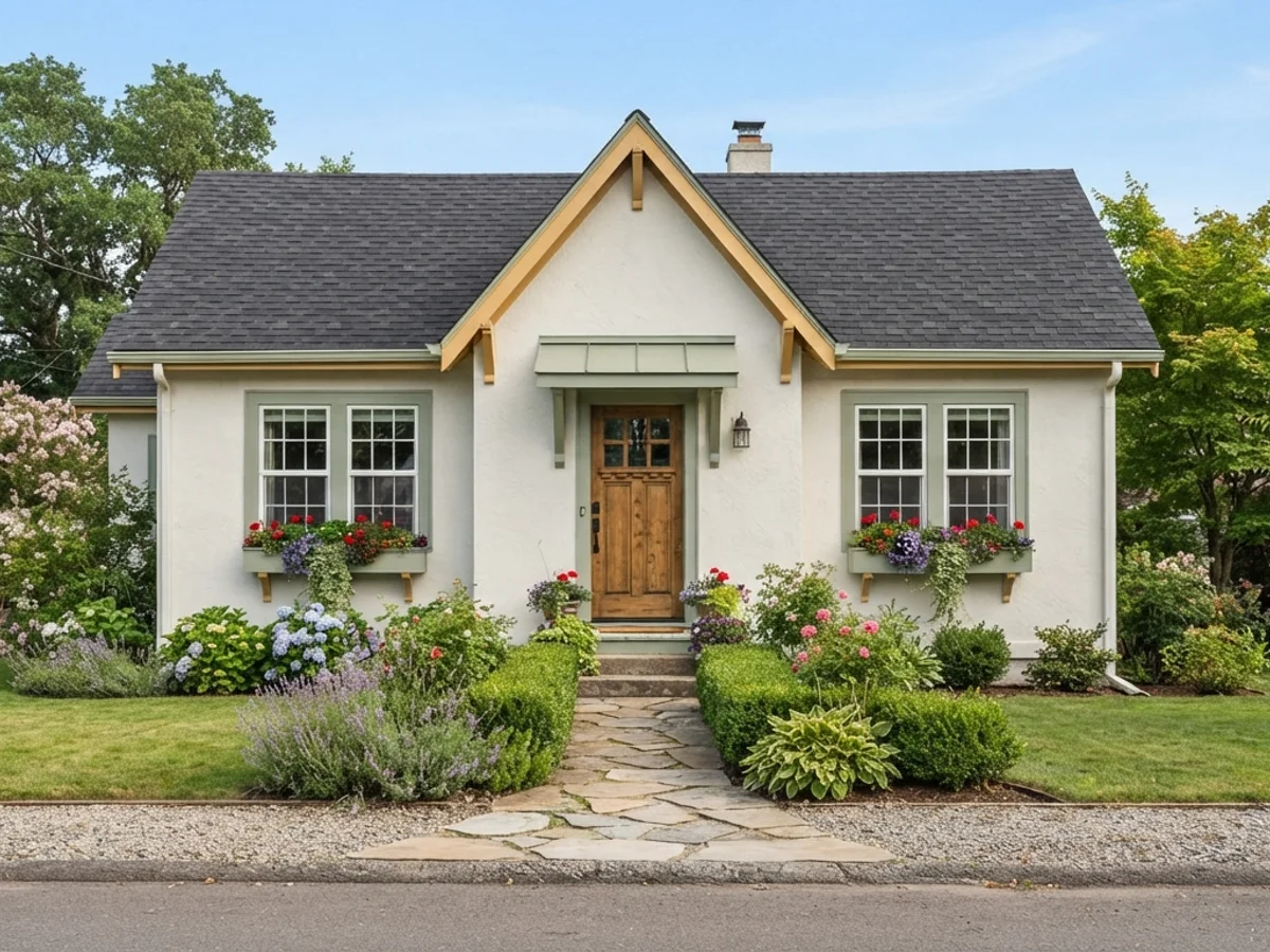
Five Cottage Schemes With Real Paint Codes
Every color here is a real, buyable Sherwin-Williams or Benjamin Moore color with its exact code. Preview it, then order the same thing. Screen swatches are approximations, which is the argument for testing on a photo of your house, not for skipping the test.
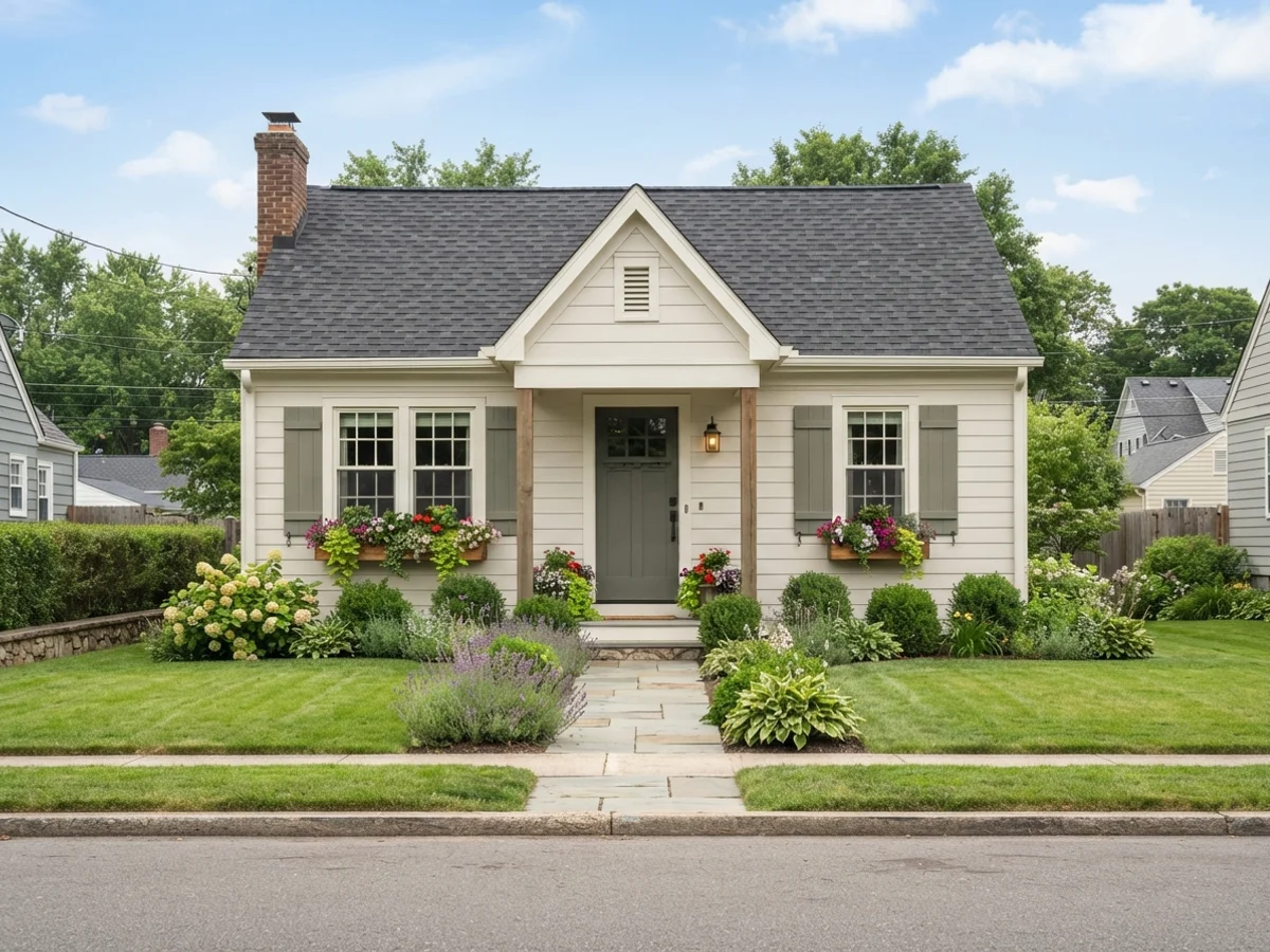
English Cream Cottage
The classic. A milky, slightly warm cream body — not stark white, not yellow — with a soft white trim and a muted green door. Steamed Milk (LRV 76) reads as aged limewash rather than fresh paint, which is exactly the point. Works on almost any small house, and it is the safest first scheme to preview if you are not sure your house can "do" cottage at all.
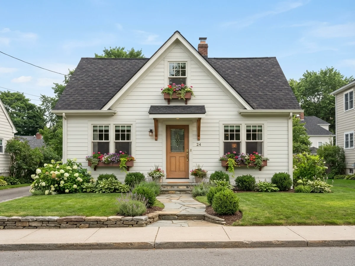
Soft White With Rose Accents
A warm white body with dusty rose on the door and a faded-brick tone on window boxes and planters. The rose has to stay grayed — Rose Bisque is a rose with the sugar taken out — or the house tips from cottage into candy. Best where there is a real garden to carry it: climbing roses, a picket fence, gravel paths. On a bare suburban lot the rose door still works; the brick accent can wait.
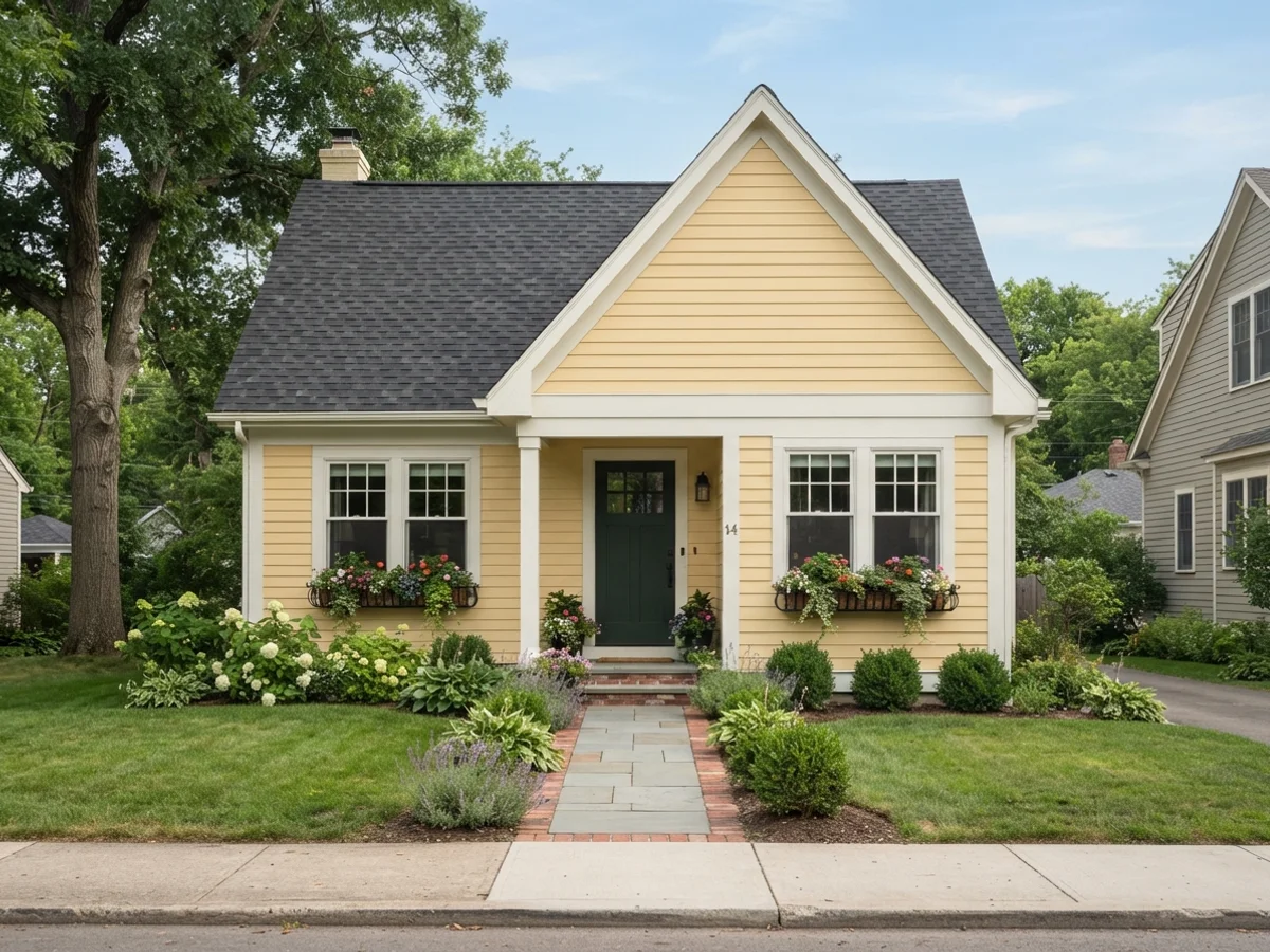
Butter Yellow Cottage
The storybook move. Hawthorne Yellow is the rare exterior yellow that stays butter instead of turning school-bus in full sun — its LRV of 71 keeps it soft. White Dove trim calms it further, and a near-black green door gives the eye one deep note to rest on. Strongest on houses with generous trim to break up the yellow; a plain vinyl box in this color can read like a single uninterrupted slab.
Sage-Green Body
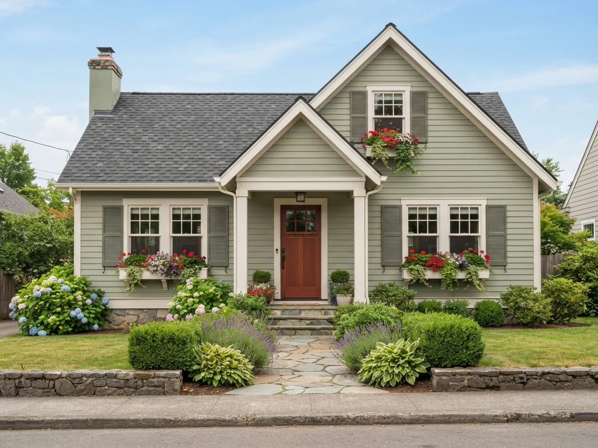
Flip the usual recipe: the green goes on the walls and the light color becomes the trim. Clary Sage (LRV 41) is gray enough to sit quietly against a garden instead of competing with it, Shoji White keeps the trim warm, and a deep copper-red door is the traditional English pairing. This is the scheme for a cottage in trees or shade — light-starved lots make whites look dingy, but a mid-tone sage looks intentional.
Storybook Gray-Blue
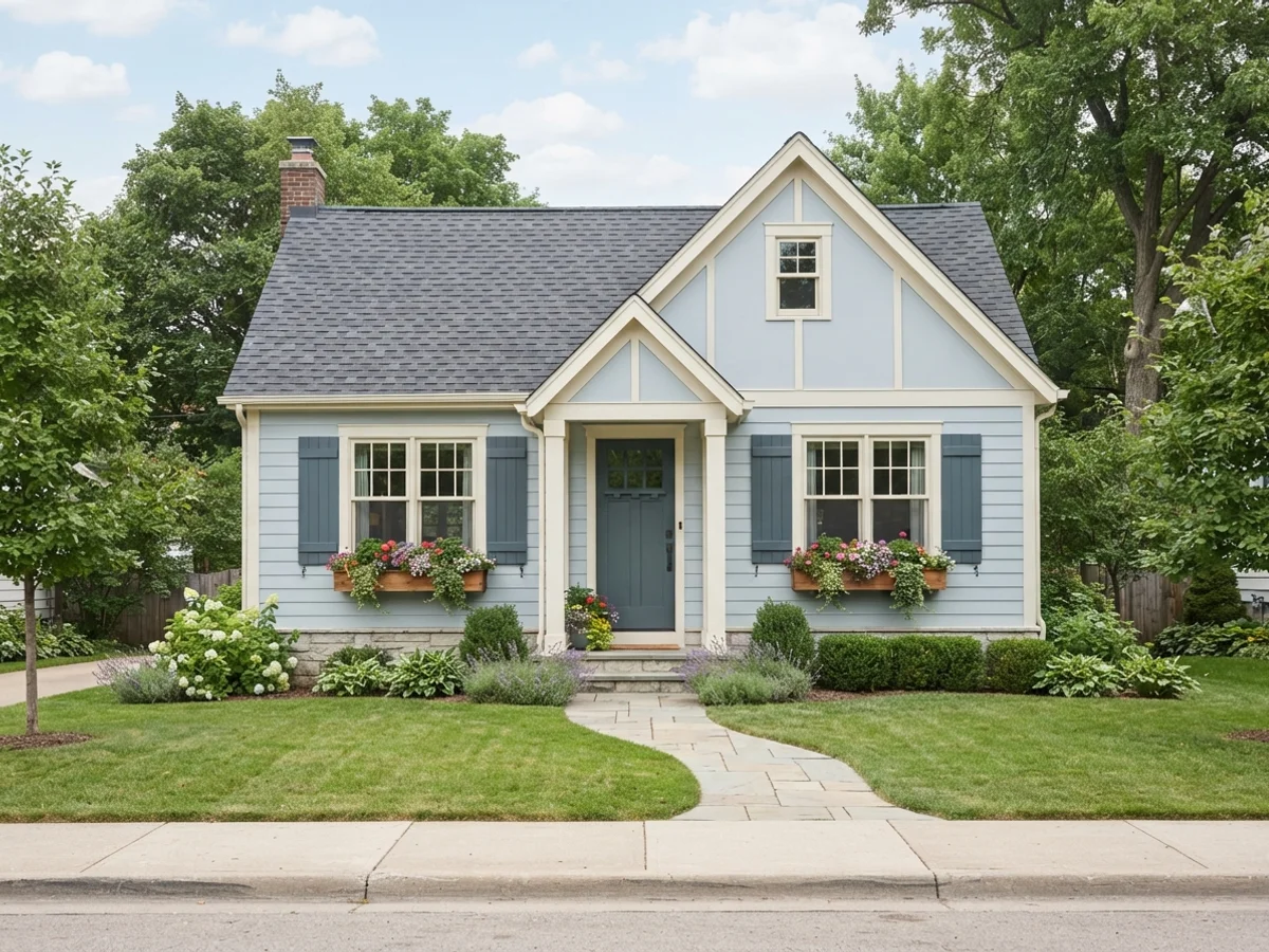
A powdery gray-blue body with creamy trim — the coastal-adjacent cottage that never announces itself as a beach house. Upward is pale enough (LRV 57) to stay soft at full-wall scale, and the warm Creamy trim stops the whole thing from going cold. Door and shutters stay in the blue family, just deeper, so the house reads as one faded color rather than a contrast scheme. Best in open light; under heavy tree cover it can drift toward plain gray.
What Makes a Color Scheme Read as Cottage
Body covers the siding. Trim sits close to the body instead of outlining it. The door is the one small deep note the eye lands on.
Three things separate a cottage scheme from every other style on this site. First, low contrast: the trim sits close to the body color instead of outlining it, so the house looks gently painted rather than drawn. Second, muted color: every hue carries some gray — sage instead of green, butter instead of yellow, cream instead of white. Third, one small deep note — usually the front door — that gives the eye somewhere to land without breaking the softness.
That recipe is also why cottage schemes fail when people brighten them "just a little." Swap the cream for pure white, add black trim, and you have painted a modern farmhouse. Saturate the sage and it turns suburban-builder green. If a swatch looks slightly dusty on the card, it is probably right.
Upload the photo. The visualizer paints siding, trim and door separately, so you can nudge the contrast up or down without starting over.
Five Cottage Looks, Rendered
Curated looks from our exterior render set. Each one opens the visualizer with its siding, trim and door colors already loaded.
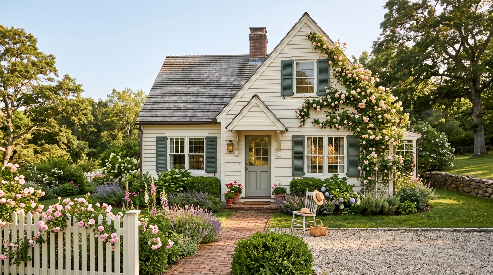
Warm cream siding, near-matching trim and a soft muted green door — the cottage look almost everyone pictures first.
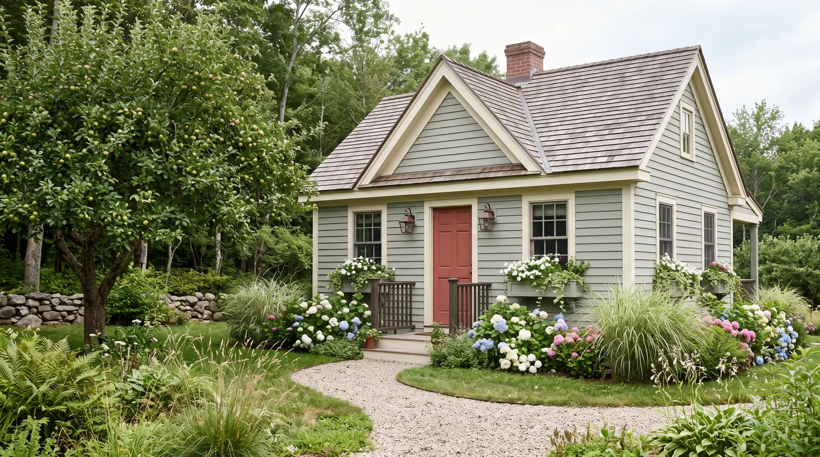
A gray-green body that disappears into the garden, warmed up by a faded brick-red door.
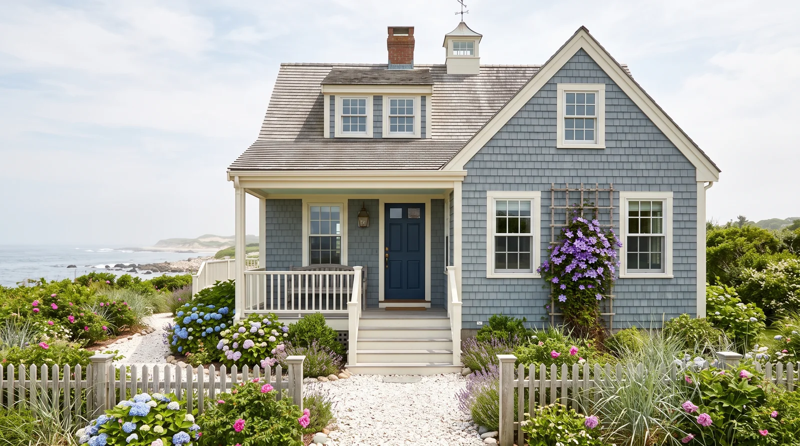
Soft weathered blue siding with a deep navy door and a haint-blue porch ceiling.
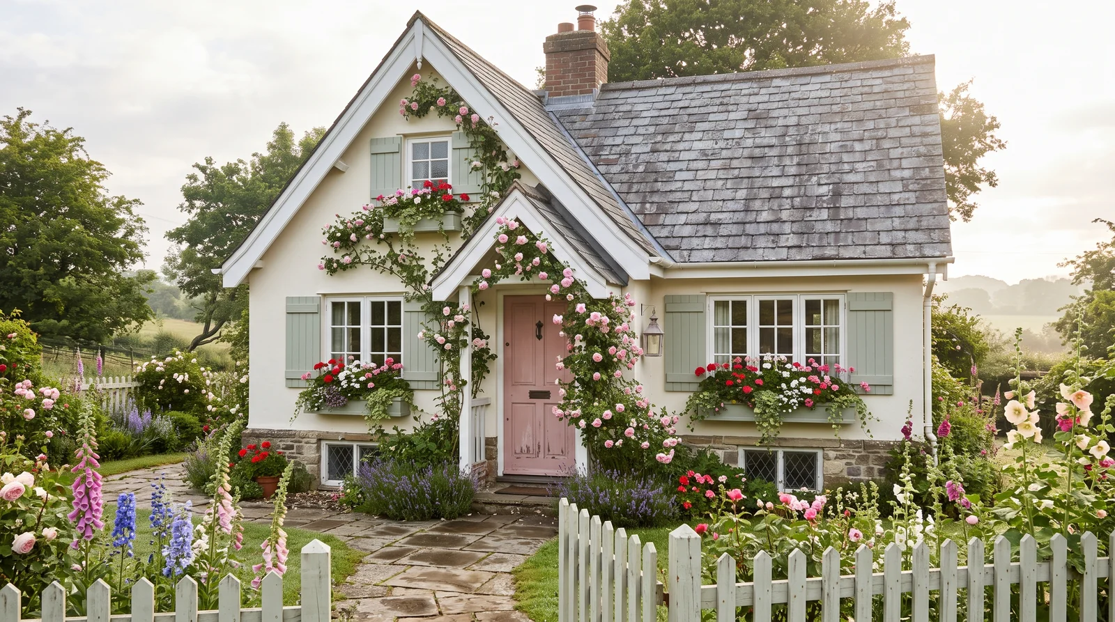
A creamy white cottage built to be a backdrop for roses, a blush door and sage window boxes.
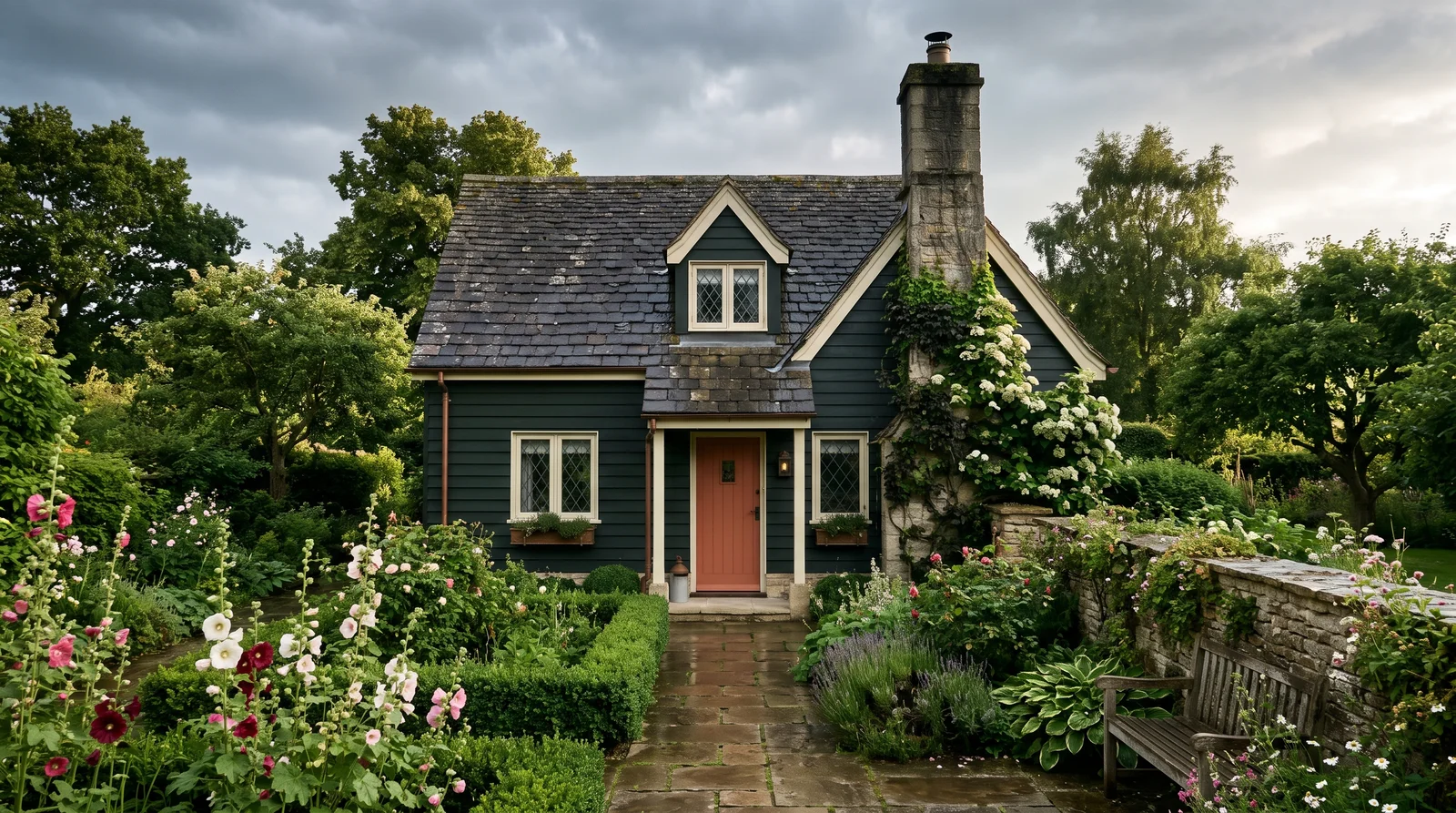
A deep, almost-black green body with pale trim and a terracotta door — small, old and cozy on purpose.
From Windham Cream to Essex Green
Cottage bodies live in the middle and upper-middle of the lightness range — deep enough to have substance, light enough to stay friendly. Hover for the name, click to try it.
The Garden Does the Saturation, the Paint Stays Soft
Cottagecore photos are full of color — roses, hollyhocks, painted furniture. But look at the walls behind them: almost always quiet. That is the translation most people miss. Chalky whites like White Dove (BM OC-17), mossy greens like Saybrook Sage (BM HC-114), faded blues like Wythe Blue (BM HC-143) — colors that look found rather than chosen, as if the house has been that color longer than you have owned it.
Two practical tests for any candidate. The "found" test: could you believe this color is thirty years old and slightly faded? Pure brights fail it instantly. The value test: cottage bodies live in the middle and upper-middle of the lightness range, roughly LRV 40 to 80. Torn between two versions of a color? The grayer, lighter one is almost always the more cottage one. This is also where cottage separates from its neighbors: a beach house pushes the blues cleaner and the whites brighter, and a Victorian uses three or four body and accent colors where a cottage uses one.
Where the Color Goes: Dark vs. Light
A cottage takes almost all of its saturation in one place, and almost all of its softness everywhere else.
The Door & Accents
- Muted green (Pewter Green, SW 6208), near-black green (Essex Green, BM HC-188), copper red (Roycroft Copper Red, SW 2839), or a deep brick like Cottage Red (BM HC-184) — dark first, colorful second
- Window boxes and shutters take the same logic at smaller scale: one accent color, repeated, beats four different ones
- That is as much dark as a cottage traditionally takes — never a dark outline on every fascia and corner board
The Trim
- Keep it slightly warmer than pure white — Alabaster (SW 7008), Swiss Coffee (BM OC-45), Shoji White (SW 7042) — and close in value to the body
- Skip any white with "extra," "pure," or "high reflective" in the name at the store — those are farmhouse whites, not cottage ones
- Bright white trim against a soft body is the single most common way a cottage scheme gets accidentally modernized
Cottage Color Is Mostly Restraint
Every failed cottage scheme fails the same way: somebody tried. The color got a little brighter to read from the street, the trim got a crisp white, the door got a cheerful red. Each move is small; together they produce a house that looks decorated.
Fade It on Purpose
Pick colors that look sun-faded straight from the can, already a little chalky and gray — you are painting the thirtieth year of the color, not the first day.
Let the Garden Be Loud
The roses and hollyhocks get to carry the saturation so the siding does not have to. That is the whole cottagecore translation.
Keep Trim One Soft Step
Not a bright white outline. The moment the trim starts drawing edges, the house stops being a cottage and starts being a diagram of one.
Age the Hardware
Swap shiny brass and plastic house numbers for iron or aged bronze first. It costs forty dollars and buys every soft color on the house another decade of believability.
More Cottage Colors That Work
Eight more chalky creams, soft sages, dusty blues, and faded butter yellows that pass the 'found' test — swap any of them into the schemes above, or preview one on its own.
Cottage Color FAQ
What makes a color scheme read as cottage?
Three things. Low contrast: trim sits close to the body color instead of outlining it. Muted color: every hue carries some gray — sage instead of green, butter instead of yellow, cream instead of white. And one small deep note, usually the front door, that gives the eye somewhere to land without breaking the softness.
Should cottage trim be bright white?
No — keep it slightly warmer than pure white, like Alabaster, Swiss Coffee, or Shoji White, and close in value to the body. Skip any white with "extra," "pure," or "high reflective" in the name; those are farmhouse whites. Bright white trim against a soft body is the most common way a cottage scheme gets accidentally modernized.
What is the one color that can be more saturated?
The front door. On a cottage it is the jewelry — the one place a deep, almost-saturated color belongs, like a muted green, a near-black green, or copper red. It works because it is dark first and colorful second.
How do I avoid overdoing a cottage repaint?
Pick colors that already look sun-faded, straight from the can. Let the garden carry the saturation instead of the siding. Keep the trim one soft step from the body, not a crisp white outline. And swap shiny brass hardware for iron or aged bronze before anyone judges the paint.
Related Styles and Surfaces
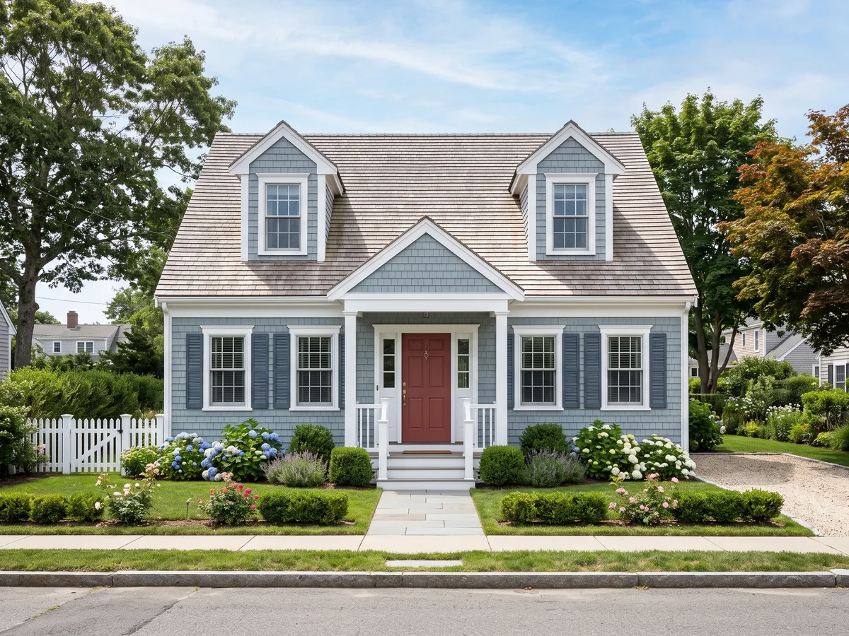
Cleaner blues, brighter whites
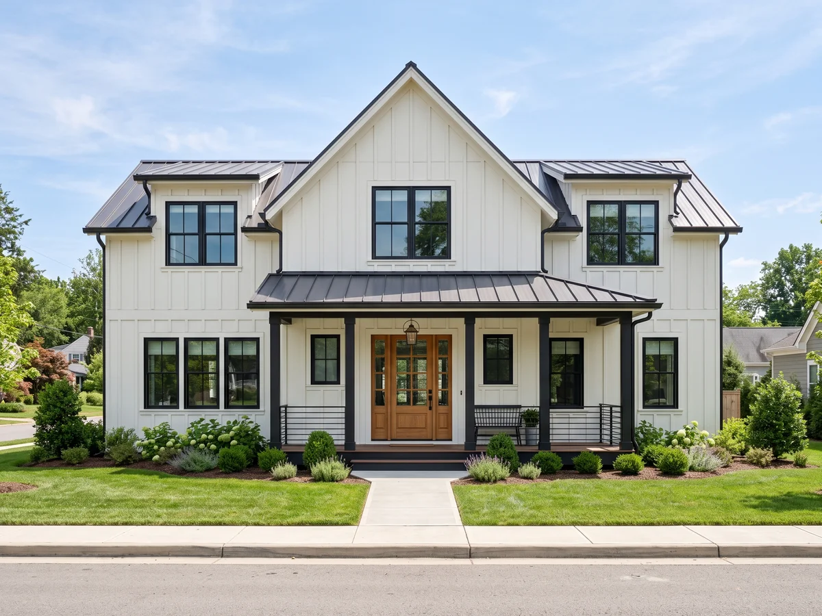
Crisp white bodies and black windows
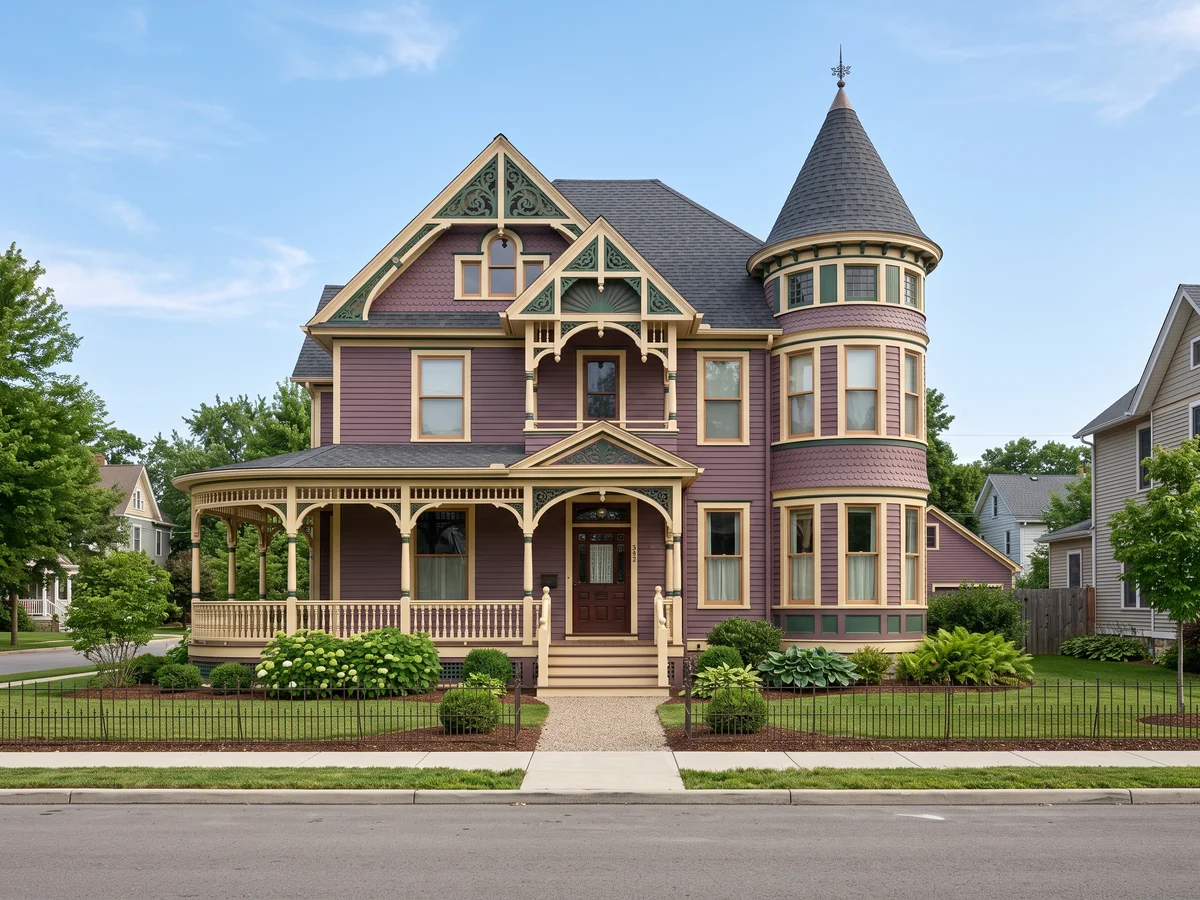
Three or four colors instead of one
One photo of your house, all five schemes on your own siding — free to start.